


Article Glossary
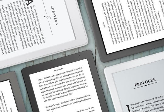
Smartphone: mobile device with a screen less than 5 inches
Phablet: mobile device with a screen of 5-7 inches
Tablet: mobile device with a screen greater than 7 inches
Screen: physical hardware
Display: what the screen outputs
Website/site: the entire site under the domain
Webpage/page: a single page on a website
Mobile-friendly: compatible with mobile devices, content transforms to accommodate smaller screens
With mobile devices becoming increasingly more powerful and versatile in their internet-browsing capabilities, office chairs are gathering dust as users slowly pry themselves from the shackles of their desktops. From July 2011 to January 2013, studies on Internet use have observed that Internet access from mobile devices has increased by approximately 16%, while Internet access from desktop computers has slipped approximately 3%.[1] Though desktops are still very much the mainstay, web content creators must now consider how their content appears for their growing mobile user base.
Adaptive or Responsive Design
One of the ways web content managers can provide their mobile user base with a pleasant viewing experience is by making a version of their website specifically for mobile devices. Adaptive web design “detects and identifies the user’s device and then generates a page matched to the device capabilities.”[2] For example, popular websites such as YouTube redirect users to the appropriate version of their website; upon visiting ‘http://www.youtube.com/’ mobile users are redirected to ‘http://www.m.youtube.com/’. Sites appended with ‘.m’ in their URL are mobile-user-facing versions of the site.
Rather than create a different structure for a website altogether, website content managers can instead use a responsive design: “a more affordable solution that uses CSS (Cascading Style Sheets) technology to create a single version of a website that auto-adjusts to display properly on all devices except the oldest cellphones.”2 Using responsive design, websites are arranged in modules that reconfigure their placement depending on the device. Panes collapse and readjust so that the content fits within a single screen.
Fast, one-page navigation
One of the biggest goals of creating mobile-friendly content is reducing scrolling – especially horizontally – to a bare minimum. Website design formats with rigid components or fixed widths are difficult to navigate as a mobile user. In a standard three-panel setup – header panel, left navigation panel, and centre main panel – the navigation panel may be the only item visible when a non-mobile compatible page first loads on a mobile device.
As a result of this, anchor points are growing in use and importance in website design. Rather than have users swipe several times across their screen, well-placed anchor points can quickly navigate them to the content they wish to see and back. Additionally, vertically long webpages with anchor points prevent loading several pages of content, which can be infuriating for users with a slow connection or limited hardware.
Keep text simple, but big
Web content managers understand that no user enjoys seeing a giant wall of text. Aside from a lack of organization and just being a pain to read, large paragraphs further complicate a site’s usability when viewed on a mobile device. What appears as four lines of text on a desktop display can expand to the entirety of a tablet’s display or a three-swipe trek on a smartphone. To alleviate this issue, it is recommended that content managers cut down on characters rather than font size.
Font styles like Bauhaus 93, Gotham Bold, and Palatino Linotype may look appealing during development, but mobile visitors of a website may be met with a bland substitute font if the native system does not recognize them. Sticking to standard fonts – like Arial, Georgia, Trebuchet MS, Verdana, and Times New Roman – can ensure that a site appears the same on both the development and user-facing platform. Alternatively, a nifty and simple tool that web content managers can use is Google Fonts – a free online tool that allows users to customize and apply a font from Google’s online library.
Emails matter a lot, but should contain little matter
Mobile Internet users spend approximately one fourth of their browsing time managing their emails. Users that send and receive simple, text-only emails do not need to worry about making their content mobile-friendly, as it will wrap naturally to fit the device’s display. However, organizations or persons looking to jazz up their messages with branding or graphics must take heed of the digital real-estate available to mobile users.
Whereas websites can use style sheets to accordingly change to an appropriate display layout, email interfaces cannot. As such, it is currently not possible to have a responsive email that will change its layout according to the detected device. Though an adaptive version of an email is not possible without pointing the user to a separate page, some organizations have chosen to only send out mobile-friendly emails. For example, YouTube’s subscription update emails are elongated by default regardless of what browser or device a user is viewing them from. By catering to the lowest common display size, their messages are easily viewed by all that receive them.
References
[1] http://www.emarketer.com/Article/How-Do-Internet-Users-Divvy-Up-Their-De…
[2] http://www.entrepreneur.com/article/226575
[3] [Mobile friendly]. (n.d.). Retrieved from http://goldengridsystem.com/wp-content/uploads/2016/10/mobile-freindly.png


