
Notice: The Statistical Consulting and Survey Research Unit was previously called the Survey Research Centre. Our unit is referred to by this name in old newsletters.
Data Visualization: Using pictures instead of words

Your survey data have been collected, cleaned, and analyzed. The hard part is over – right? No! Reporting the data findings clearly and concisely to an audience that is not intimately familiar with the data is likely your next challenge.
Data visualization, the presentation of data in visual form, can make complex data easier for your readers to understand. Based on information presented at the 2018 American Association for Public Opinion Research (AAPOR) annual conference, there are some best practices to keep in mind when presenting a visual representation of data.
First, let’s explore some of the different ways to use data visualization. Consider the following examples using Canadian male and female median annual income data.
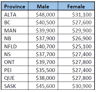
Exact Number Table
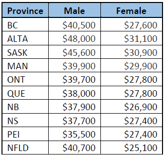
A clearly labelled table is useful when it is important to show the numbers, but even so there are data sorting considerations to be made in order to present meaningful tables. For example, when creating a table to present the median annual income by gender and province, is it best to order the provinces in:
- alphabetical order
- in geographic order (for example from West Coast to East Coast), or
- in order from highest median annual income to lowest average income for Females)?
-
Alphabetical order
- Geographical order
- Highest male median annual income order
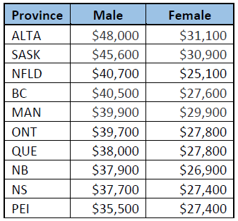
Both tables 1) and 2) convey the same message that males tend to have higher median annual income compared to females across all provinces, but only table 3) easily illustrates the added information of what provinces have the highest median annual income and the lowest median income.
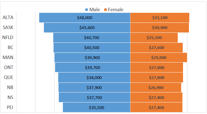
Visualizing Patterns
Graphs and charts can be better formats to quickly visualize patterns in data. In this example, the data have been sorted from the highest male median income to the lowest male median income and shown in rank order by province. Graphs are useful to highlight data insights. This graph not only clearly depicts the provinces with the highest median annual income versus the lowest median annual income, but also shows the differences between male and female median incomes. Additionally, it identifies that while Newfoundland and BC rank near the top in terms of median income for males, these provinces are closer to or at the bottom of the rank order list among females.
Illustrations
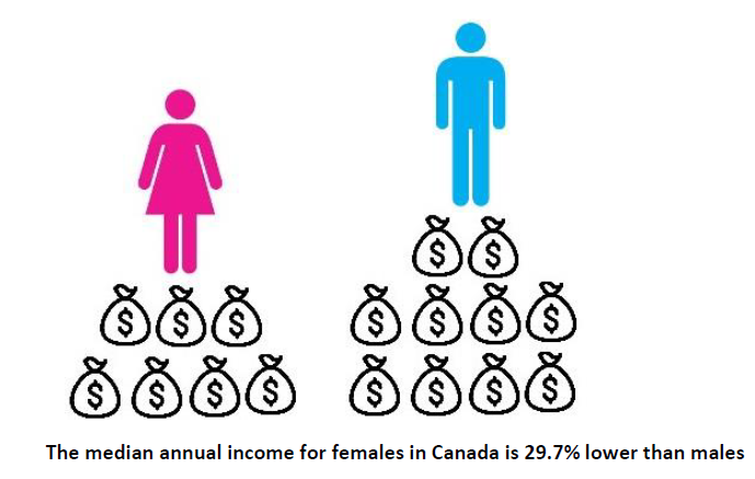
Infographics are useful to summarize top line results. However, caution should be used with this type of visualization. The purpose of Infographics is to let the picture convey the message and use very little supporting text. As a result, there is risk that people may receive a message from the picture that was unintended. For example, the picture below is meant to convey that median annual income for females in Canada is 29.7% lower than males. However, the eye can play tricks in terms of the relative size of the figures (is the female symbol in fact larger than the male symbol?) or there may be an unintended interpretation to the positioning of the figures (is the female symbol 50% lower than the male symbol?). Even the bags of money depicted may convey a different message such as females have 41.1% of the bags (i.e. 7 out of 17), while males have 58.8% of the bags (i.e., 10 out of 17). The difference is 17.7%.
Source: Statistics Canada, 2016 Table 11-10-0239-01 Income of individuals by sex and income source, Canada and provinces
For detailed research reports using survey data, researchers may be more likely to use graphs or charts to present their findings. The type of data that is being presented can help determine the best format of data visualization to use.
Discrete data
Discrete data are represented by whole numbers that result from counting. Column, bar or pie charts are commonly used to present discrete data.
Continuous data
Continuous data are represented by a range of data that results from measuring. Line, bar or histogram charts are often used for discrete data.
The number of variables being compared can also help define the visual.
Univariate
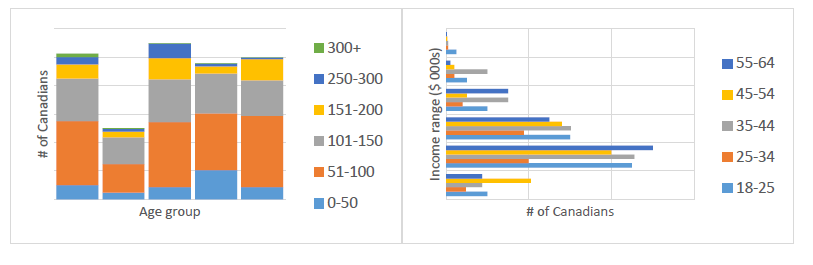
The distribution of a single variable. For example, column or bar charts are used to show the number of Canadians at different income levels.
Bivariate
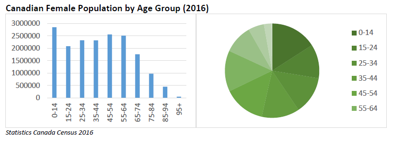
The relationship between two variables. For example, stacked bar or clustered column charts show the number of Canadians at different income levels by age group.
Multivariate
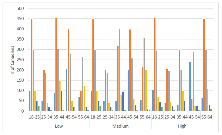
The relationship between multiple variables. For example, more complicated charts such as layered clustered column charts present the number of Canadians at different income levels by age group and education level (presented as low, medium and high income). It is important to note how the complexity of interpretation increases with each variable that is added to the graph. Showing too many variables may become overwhelming for the reader.
Once you have decided on the type of graph, there are some design do’s and don’t’s to consider:
Design do’s (and don’ts)
Do consider your audience.
- Do choose visuals and language that are appropriate for your readers. For example, do they have the capability to process more complex data and representations? If not, the simpler, the better.
Do make the data clear to the audience.
- Don’t try to show too much data in one chart.
- Do sort the data so that patterns or insights are obvious.
- Do carefully consider colour choices for charts. For example, using too many colours can be distracting to the reader. People with colour blindness may not be able to discern the difference between green and red. Also, make sure to use colours that are easily distinguishable.
Do use clear and consistent graph elements.
- Do ensure tick-marks and gridlines don’t interfere with the data being presented.
- Do label each axis and all scales.
- Do use a font size that can be easily read.
- Do use common baselines when comparing graphs. Groups of graphs should use consistent scales and colours.
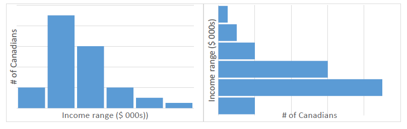
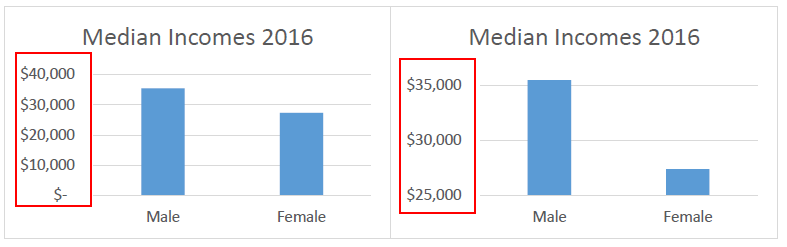
- Do use appropriate scales, for example, if the data add to 100%, make sure that the axis of percentages does not exceed 100%! Also, using too narrow a range in the scale can distort the meaning of the data. For example, although the data used in the two charts below are identical, in the chart on the right the income range in the vertical axis scale has been narrowed, giving the perception that the difference between male and female median incomes is much greater than in the chart on the left.
Do plan to make a few iterations.
- Most effective visualizations start as exploratory graphics. Do allow time to make some adjustments to get it right.
Data visualization is a useful tool for presenting data and as an alternative to lengthy text descriptions. However, it is important to remember that the focus should be on presenting clear, insightful data and not just show pretty pictures.
This article outlines just a few of the insights to consider when using data visualization. The experts at the Survey Research Centre at the University of Waterloo provide survey design, programming, hosting and top-line data analysis for web, telephone, mail and face-to-face surveys. For more information on how we can help you with your research project, please contact us.
What the Private Sector Thinks about Sustainability
Governing and Accelerating Transformative Entrepreneurship Survey (GATE)

Sustainability is an increasingly important goal in our society in the face of a changing climate. While governments have the ability to regulate and tax organizations in an attempt to control greenhouse gases, the private sector may also have an important role to play in voluntarily choosing to take a lead in sustainability action.
The private sector has the ability to shape consumer preferences, create innovative products and services, and influence policy. Small and medium-sized enterprises (SMEs) employ most individuals in the private sector, and are also responsible for the majority of private sector pollution. Small firms, in particular, may offer some insight into how barriers to sustainability can be overcome, and the role that policy can play in accelerating progress toward a more sustainable future.
Dr. Sarah Burch, of the Department of Geography and Environmental Management at the University of Waterloo, studies small and medium-sized businesses with regard to their role in fostering the wellbeing of communities and their potential to create significant technical and social innovation. The main objective of the Governing and Accelerating Transformative Entrepreneurship (GATE) Study is to better understand the barriers and opportunities that these businesses face in adopting and implementing more sustainable business practices.
The Survey Research Centre (SRC) provided survey consultation, sampling, programming and hosting services for a large survey conducted as part of the GATE Study. Compiling a large enough sampling frame of SMEs and encouraging busy business people to complete the survey was challenging. The SRC employed several sampling sources such as publicly available records and purchased lists. The sampling frame for Vancouver businesses also included members from a panel firm. A total of 1,735 online surveys were completed among SMEs in Toronto, Vancouver, and London (UK). The survey was conducted from May to August 2017.
Sustainability is important
The study found that while less than 20% of SMEs report that environmental and social sustainability are at the core of their business model, 80% indicate that sustainability is important, very important or extremely important to their business, and at least half are attempting to make their business operations more sustainable. Furthermore, smaller firms having fewer than 99 employees tend to perceive sustainability to be more important, both personally and to their company, than larger firms.
Respondents were asked what measures their companies could take in order to become more sustainable. Over 70% of SMEs indicated that reducing company waste production and changing employee behaviour to be more environmentally friendly were important steps they could take. Just over half of SMEs indicated that the purchase of new equipment or services and changing suppliers were important measures as well. Interestingly, a high number of SMEs report they have already implemented processes to reduce waste and change employee behaviour (76% and 81% respectively), while (despite its importance) only 35% of those who considered the purchase of new equipment and services to be important had taken this step. This suggests that, for some sustainability actions, there is a gap between the desire to take action (or its perceived importance) and the capacity to do so.
Reputation matters
In terms of what motivates small businesses to make progress on sustainability, the study shows that the most important reason cited by SMEs to become more sustainable is to improve community reputation. Reducing costs was the second most important factor, suggesting that local, bottom-up dynamics and local values are at least as important as market factors to small firms. Aligning business operations with personal values is the third most important driver, while government regulation is a comparatively weak driver.
Barriers to sustainability
As expected, the results indicate that lack of time is the most significant barrier to making progress on sustainability (a challenge for 62%), followed by funding (a challenge for 59%) and availability of staff (a challenge for 54%). Interestingly, knowledge about which action to take and business culture is not perceived as much of a challenge to most SMEs — a result that would likely change if respondents were specifically considering more transformative sustainability actions rather than the incremental steps that come most readily to mind.
The GATE project’s data clearly demonstrates that, while SMEs generally feel that sustainability is important, they face significant capacity barriers. Even so, many SMEs are motivated by social factors, such as reputation and a sense of personal responsibility, even more powerfully than they are motivated by increasing sales or improving profits. The results of the survey suggest the existence of synergistic relationships between the wider community context and the internal operations of SMEs. Sustainability efforts of SMEs can have a significant impact on society, in particular, by making customers’ practices more environmentally friendly and improving the wellbeing of employees and local residents.
The Survey Research Centre was proud to assist Dr. Burch with this important research. For more information on how the Centre can help you to target difficult-to-reach populations, please contact us.
Segments of this article first appeared in the following report: Burch, S 2018, ‘Small Businesses and Sustainability Innovation: Confronting the Gap between Motivation and Capacity’, Centre for International Governance Innovation, Policy Brief No. 127 pp.1-7.Interested in Affordable Research?
Share survey research costs and collect high-quality data. The Survey Research Centre (SRC) conducts an annual survey of the Waterloo Region called the Waterloo Region Matters Survey where interested researchers and organizations can collect data for a fraction of the cost of an independent telephone or web study. This unique opportunity is of particular benefit to researchers and organizations with limited budgets who want to test research concepts such as public opinions on specific issues, measure awareness and usage of services or products, or refine survey questions for other research.
Key Details:
Study population: Adult residents within the Waterloo Region, including Kitchener, Waterloo, Cambridge and the four townships.
Sample size: 500 completed surveys, representative by region/municipality and age.
Methodology: Random-digit dialed (RDD) telephone and web surveys. RDD sampling of households within the Waterloo Region population and random selection within the household are used in initial recruitment by the Survey Research Centre (SRC). This approach more accurately represents the Waterloo Region compared to non-probability sampling methods, such as recruiting members from web panel firms. The sample used for the web component of the Waterloo Region Matters Survey was originally recruited using RDD. Having a random selection of respondents and data that are representative of the population are important aspects of data relevance and utility.
Next iteration of data collection: January-March 2019, data file available in April, 2019
Deadline to express interest: October 31, 2018
Cost: $2,990 for a page of 4-5 questions. For more information about the Waterloo Region Matters survey, please visit the Waterloo Region Matters web page, contact [contact updated 2023: Tony Ly or call 519 888-4567 ext. 35071].
Can't wait until the next Waterloo Region Matters survey? Consider using the Waterloo Region Matters Panel. The SRC maintains a small probability-based web survey panel that is fielded in conjunction with the Waterloo Region Matters Survey. For more immediate projects that do not require large sample sizes of Waterloo Region residents (e.g. n=200 respondents or fewer), a web survey can be fielded at any time.
Featured Projects
Legalization of Online Gambling in Canada survey:
Dr. Tara Elton-Marshall, from the Centre for Addiction and Mental Health (CAMH), is examining the possible shifts in attitudes and behaviours associated with legislation changes for online gambling. This research will help inform the development of online gambling and problem gambling prevention programming in schools in Ontario.
The SRC provided survey design and telephone data collection services for this longitudinal study. Baseline Random Digit Dialed (RDD) telephone survey research was conducted in 2013. Two follow-up re-contact and replenishment waves were administered in 2015-2016 and 2017-2018 following legislation changes and the launch of the Ontario Lottery and Gaming Corporation (OLG) online gambling website. Telephone fieldwork for the latest wave occurred from October 2017 through to March 2018.
The Centre for Education in Mathematics and Computing:
The CEMC is Canada’s largest and most recognized outreach organization for promoting and creating activities and materials in mathematics and computer science. Among their efforts are the face-to-face workshops “Think About Math!” and the “Workshop in Computer Science for Young Women”, held on university campuses across Canada.
The CEMC is interested in tracking the perception and evaluation of their programs over time in order to explore how these programs might improve, as well as to examine the impact that these programs may have on female high school students pursuing math and computer science at the post-secondary level. To obtain this information, the CEMC conducts both online and paper surveys immediately before and after each workshop, as well as an annual follow-up survey for five years after the workshop. The Survey Research Centre (SRC) has provided survey programming as well as data collection and data entry since the initial survey launch in 2010.
Management of Oral Anticoagulation Therapy Course Survey:
Dr. Jeff Nagge and researchers from the School of Pharmacy, University of Waterloo, are assessing the value of including practical experience in a continuing professional development program.
The program is designed to prepare health care professionals to provide anticoagulation management services. The SRC provided survey design, and both online and telephone data collection services. The data collected will be used to inform the development of continuing education courses at the School of Pharmacy. Data collection occurred from October to November 2017.
Announcements

Dr. Mary Thompson has officially retired as Associate Director of the Survey Research Centre (SRC) as of June 30, 2018.
Mary has been instrumental to the operation of the SRC as co-founder, as a co-director and associate director since the SRC’s inception in 1999. Mary is a Distinguished Professor Emerita in the Department of Statistics and Actuarial Science at the University of Waterloo, where she was a faculty member from 1969 to 2009. Mary’s judicious counsel and unwavering support for the SRC will be greatly missed. We wish Mary well in her retirement.
The SRC continues to benefit from the guidance of its current co-directors, Dr. Christian Boudreau and Dr. Susan Elliott.