A presentation at the 2024 Eye Data and AI Summit
By Professor Anita Layton
Canada 150 Research Chair in Mathematical Biology and Medicine
Professor of Applied Mathematics, University of Waterloo
Future Medicine
-
The future of medicine is personalized.
-
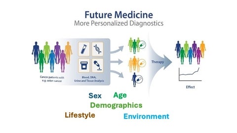
Every patient is shaped by a unique combination of sex, age, lifestyle, environment, and genetics. These factors influence how diseases develop, how symptoms present, and how treatments work — but they’re often invisible to traditional diagnostic tools. To truly personalize care, we need a new kind of lens. That’s where mathematics comes in. Like a microscope, mathematical models allow us to zoom in on the hidden mechanisms that drive health outcomes. They help us simulate, predict, and understand — not just what’s happening, but why.”
Future Medicine is Personalized
Personalized medicine shaped by a unique combination of sex, age, demographics, lifestyle and environment to drive better health outcomes.
Sex differences in health
Heart attack symptoms differ between men and women
Male

- Squeezing chest pressure or pain
- Jaw, neck or back pain
- Nausea or vomiting
- Shortness of breath
Female

- Chest pain, but not always
- Pain or pressure in the lower chest or upper abdomen
- Jaw, neck or upper back pain
- Nausea or vomiting
- Shortness of breath
- Fainting
- Indigestion
- Extreme fatigue
Sex Differences in Physiology

Sex Differences in Drug Processing
|
Females |
Body composition |
Males |
|---|---|---|
|
Slower processing of most drugs More accumulation of lipophilic drugs Different concentrations of hydrophilic drugs (also dependent on stages of menstrual cycle) |
Fat mass Lean mass Free water |
Faster processing of most drugs Less accumulation of lipophilic drugs Different concentrations of hydrophilic drugs |
|
Higher resting heart rate Longer QT intervals Higher risk of arrhythmias |
Variation in heart rate |
Lower resting heart rate Shorter QT intervals Lower risk of arrhythmias |
|
Slower absorption of drugs |
Gastric motility |
Faster absorption of drugs |
|
Different expression of cytochrome P450 (more CYP3A4 in women) |
Stomach PH |
Different expression of cytochrome P450 (more CYP2D6 and CYP2E1 in men) |
|
Oestrogen and progesterone compete with drugs for degradation by CYP450 |
Liver enzymes |
|
|
Slower excretion of drugs |
Kidney excretion |
Faster excretion of drugs |
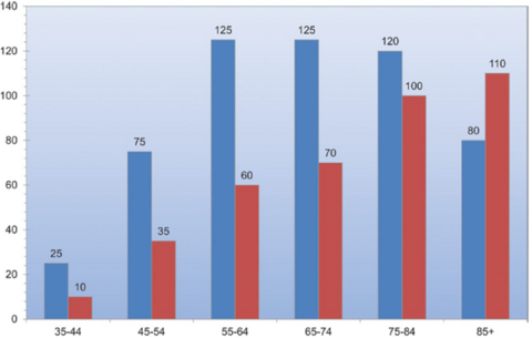
Sex As a Risk Factor for Glaucoma and Diabetic Retinopathy
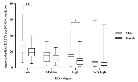
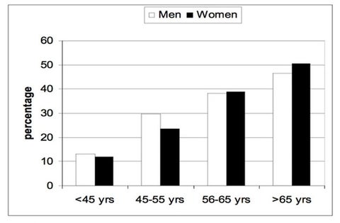
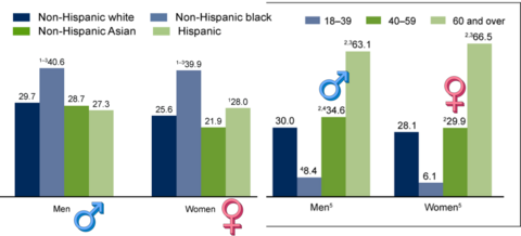
Hypertension Prevalence: Ethnicity, Sex
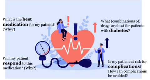
Math as the New Microscope in Medicine
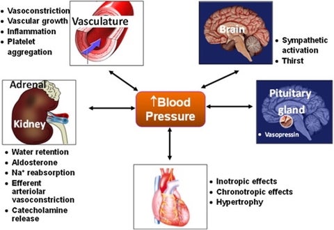
Blood Pressure Regulation
Sex-specific Blood Pressure Regulation Models
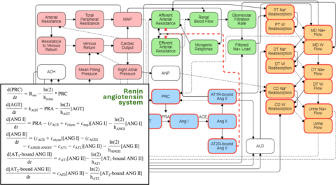
Leete and Layton, Comput Biol Med 2019
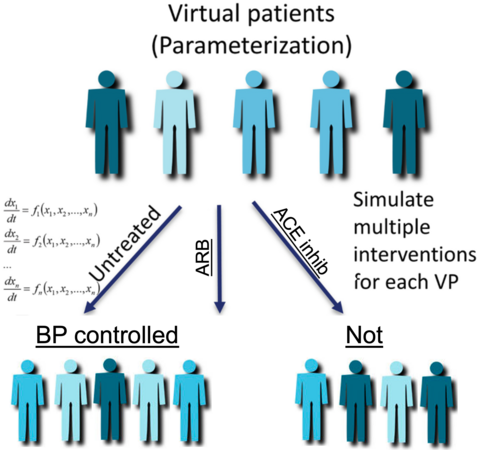
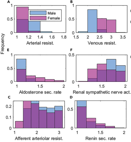
Drug Testing Using Virtual Patient Cohort
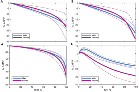
Simulated Response to Different Classes of Anti-hypertensive Drugs
- At high dosages, BP drops more in women.
- Women respond better to ARB than ACEi.
- Women respond better to thiazide diuretic than men.
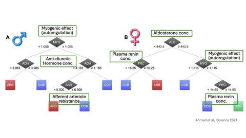
Using Underlying Pathophysiology to Predict Optimal Drug Class
Each model has strengths and limitations
Mechanistic Models: Pros
- Hypothesis testing
- Predictions
- Biological insights
Mechanistic Models: Cons
- Extensive biological knowledge required
- Model parameters may be unknown or difficult to determine
Data-driven Models: Pros
- Pattern recognition
- Predictions
- Biological insights
Data-driven Models: Cons
- Overfitting
- Data volume requirements
- Lack of transparency
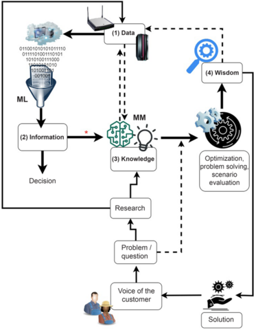
Integration of Mechanistic and Data-driven Models
- Translation of data à information à knowledge à wisdom
- Research may generate both data (1) and knowledge (3)
- ‘Big data” interpreted by ML may generate information (2)
- MM may yield knowledge (3), which can be used to derive wisdom (4)
- Hybridization of ML and MM may close the loop between prediction accuracy and causality
In Conclusion: Math as the new microscope in medicine
Math, like a microscope, allows us to see what’s hidden: the underlying mechanisms, the subtle differences, the personalized pathways. In medicine, math is helping us move from generalized treatment to personalized care.
