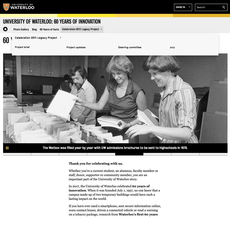
Website navigation systems provide visitors with the ability to explore a website quickly and efficiently to find information relevant to them.
In the WCMS, there are two menus available to website creators:
- Main navigation:
- Located in the grey bar immediately below the website title
- Recommend for all menu links
- Information for (not recommended for new websites):
- Located in a white bar below the main navigation (when used)
- Provided for backward compatibility with WCMS 2 websites
- Users often find multiple navigations confusing, therefore this is not recommended for new websites
You can choose to augment these menus with additional elements such as:
- Calls to action buttons
- Links on banner images
- Related links
- Sequential page links (e.g. "previous page" or "next page" links).
These can be useful if you're attempting to drive users to specific pages or encourage them to take a particular user journey. You can see examples of these on the WCMS sample website home page.
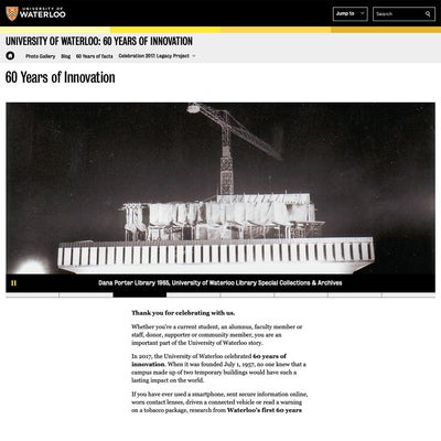
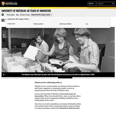
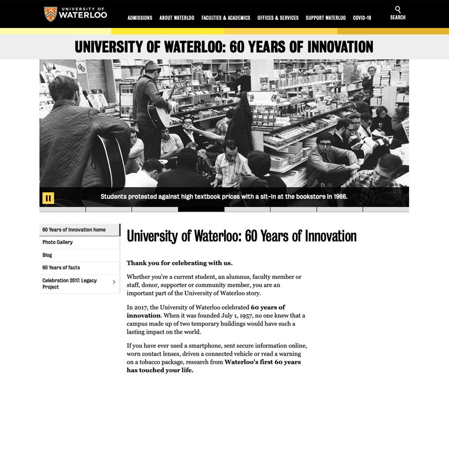
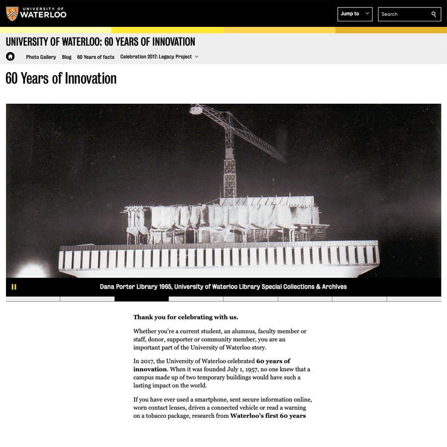
Comparison of WCMS 2 and WCMS 3 menus
Click the images below to enlarge.
Why did the menu design change?
Prior to WCMS 3, both the "main navigation" and "information for" menus were most commonly found on the left side of the web page. However, there were several website types (e.g. publications, conferences and singe page websites) that had different menu layouts or no menu at all. This variation caused user confusion and significantly increased the complexity of maintaining the WCMS.
In WCMS 3, menus are displayed in a horizontal bar at the top of the page, just below the website title.
These changes provide a more consistent user experience while enabling increased page design and layout flexibility. For example:
- Web page content can now extend the entire width of the page (extra-wide contained) or as wide as the screen (full width).
- Multi-column layouts can be used to organized content and images more effectively.
- Additionally, the "mega-navigation" design of the menu fly-out presents all sub-pages under a particular top-level menu item in one view. This helps users quickly find the page they are interested in and navigate to it directly.
Best practices for an effective navigation menu
Within the fields of user interface (UI) design and user experience (UX), significant research has been conducted to understand the effect of cognitive load on a user's ability to effectively engage with a website or digital application.
Defined by the American Psychological Association, cognitive load is "the relative demand imposed by a particular task, in terms of mental resources required." When designing websites, designers and usability experts must consider the cognitive load required to navigate the site.
When populating a menu, there is a correlation between the number of options and cognitive load. As the number of menu items increase, so too does cognitive load. Large menus can quickly overwhelm users while fewer options make websites seem easier to use and increases engagement.
Well-designed menus should:
- Have no more than 7 top-level items
- Go no more than 3 levels deep (e.g. top-level link, child page, grandchild page)
- Group similar items together and hide sub-pages until they are needed.
For example, create a top-level "Students" page with "Undergraduate" and "Graduate" listed below. - Use consistent language across the Waterloo website (see Waterloo's style guide)
For example, use familiar terms like "contacts", "news", and "events" rather than "directory", "stories" or "activities".
When working on WCMS websites, consider:
- Avoiding the use of the "information for" menu by merging your top-level links into the the "main navigation"
- Using calls to action (CTAs) sparingly, with no more than three at a time. These should be used to strongly encourage your users to take a particular action. If there are several options to choose from, consider bulleted lists or grouping your content differently. (see CTA how-to guide for more information)
Working on websites for faculties, schools or academic departments? Please contact your faculty website lead first. They will co-ordinate any support required from University Relations and IST.
- Arts: Elizabeth Rogers
- Engineering: Erica Clement-Goudy
- Environment: Netzach Straker
- Health: Michelle Douglas-Mills
- Mathematics: Nick Di Benedetto
- Science: Sarah Forgrave
A note about the design process
Design changes present in WCMS 3 were made as part of a collaborative process involving many partners across the University including:
- All faculties and large academic support units
- Web Advisory Committee
- Web Steering Committee
As development of WCMS 3 continues, University Relations and Information Systems and Technology continue to work together with these groups to continually improve the University's website and adapt to changing technologies and user behaviours.

