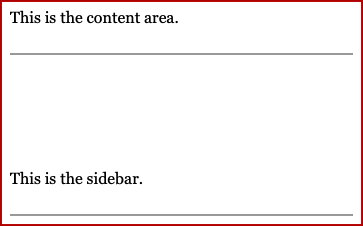
Do you know that columns and sidebars can change widths, and stack at narrower screen widths? This is known as responsive design, because the design responds to different devices and screens.
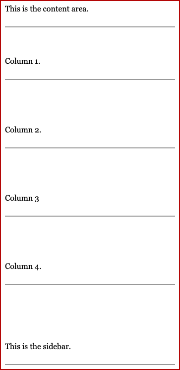
As the screen gets narrower, the content area will get narrower. Eventually, the sidebar (if present) will stack underneath the main content area.


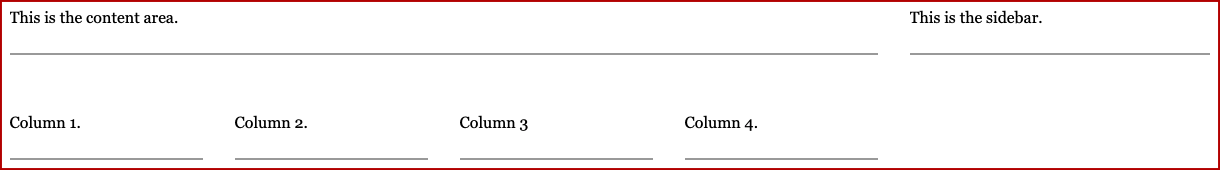
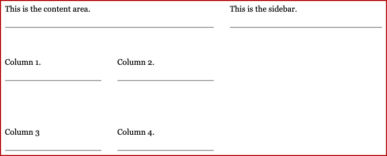
When you add a section with multiple columns, the columns will gradually stack, with the sidebar following the same rules as before.
Because sizing can change, you should avoid anything that relies on things being an exact size - for example, "positioning" text using spaces, or "slicing" an image into multiple pieces and putting them side by side.
Because alignment can change, as well as for accessibility purposes (screen readers don't announce layout), you should avoid mentioning anything as being in a specific alignment to another piece, e.g. "see the screenshot on the right".

How did you like this tip? Is this something you are already doing, or maybe something you will look to adapt? Are you inspired with suggestions for future tips? Send us feedback!