One of the things we have heard consistently in user feedback, surveys, and even in casual conversation, is that users want a more flexible WCMS. We want you to know that we're listening, and that this is one of the core goals of the WCMS 3 project.
Simplifying site types
A primary step we're taking in this direction is what we're calling the "one theme" approach. Right now, in WCMS 2, we have 4 main site types - "responsive" (also known as "FDSU"), publications, single page, and conference. Each has a different appearance and a different set of features, and it is not possible to mix these within a single site. With WCMS 3, we will be unifying these site types and you'll be able to mix and match features on a single site - even to the point of being able to put, say, elements that are currently only available on single page sites into the middle of a standard web page.
With this added flexibility comes added complexity, and we needed to look beyond the "here's a giant editor with a ton of buttons at the top, put everything in there" approach that is generally the authoring process in WCMS 2. While this approach may seem relatively straightforward, it can be difficult to work with and sometimes fragile (have you ever accidentally broken an expand/collapse while trying to edit it?).

Introducing Layout Builder
With WCMS 3, most page building will use Layout Builder, which was introduced in Drupal 8.5.0 as an experimental option, and was officially marked "stable" with the release of Drupal 8.7.0.
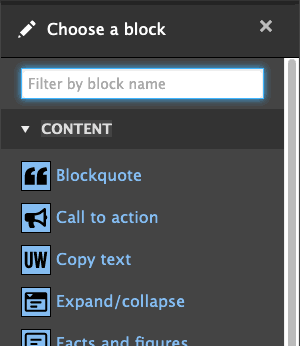
With the use of Layout Builder, everything is a block, and nearly everything can be created on the fly. You don't have to go to a second page first to, say, create a call to action - you can create the call to action as you are adding it to the page. Everything you add to the page has both an icon and a text label, so you know what you're inserting. And things like expand/collapse elements and blockquotes become much less fragile, as they move from things that are inserted via the editor to discrete items that enforce their structure.

Note: this screen shot only shows a handful of the options currently available.
As site navigation menus are moving to a horizontal structure with WCMS 3, the full width of the browser is available for content, and Layout Builder allows you to put together pages that combine content widths - from narrow, to wide, to extra-wide, to full width - in seperate sections as you go down the page, and lets you mix-and-match column options from 1 to 4 columns within those sections, with a variety of options for the proportions of column widths. Of course, everything remains fully responsive and layouts adjust as the browser gets narrower.
With Layout Builder, nearly everything you add to the page has a live preview - no more black thumbnails for videos and other embeds.
Layout Builder also unlocks possibilities that would have been difficult to impossible to implement as buttons in the text editor, particularly with live previews. Expected to launch with the initial release of WCMS 3 is the ability to add arbitrary listings of blog posts, events, and news items, filterable by tags, anywhere on your page. Home page banners will become simply "banners" and be placeable anywhere, on any page. Forms can be placed anywhere on the page as well, including inside columns.
There are so many possibilities with Layout Builder and we're only just getting started. We will launch WCMS 3.0.0 with an initial set of blocks based on what's available on FDSU sites, and expect to add new blocks and options with each major WCMS release for the foreseeable future, as we start bringing in functionality from single page, publication, and conference sites.
We hope you are looking forward to using Layout Builder as much as we are!