This past winter semester I launched a new course at the University of Waterloo called "The Geoweb and Location-Based Services (PDF)". This 4th-year course introduced senior undergraduate students to the theoretical concepts and practical techniques of Web 2.0, Volunteered Geographic Information, Open Data, the Geoweb, and location-based services using mobile phones. As part of this course, students worked in groups to complete a major project.
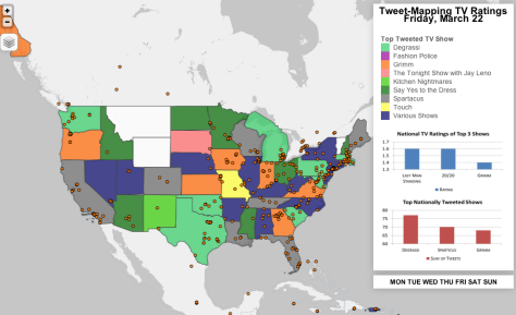
One project that stood out was “Tweet-Mapping American TV Ratings” by the team of Andrea Minano, Sarah Knight, and Michael Goldring. The aim of their project was to analyze the relationship between social media and the popularity of television shows through ratings. To do this, they gathered data from the social media network Twitter. According to Socialguide.com, 32 million individuals in the United States tweeted about television in 2012. Additionally, studies recently conducted by the television ratings company Nielsen, suggest that Twitter is a robust way to derive TV ratings. Here you can see a map of TV shows from Friday March 22nd, with the location of individual tweets shown:
The use of Twitter to rate the popularity of TV shows was tested in this project by gathering tweets from March 18, 2013 to March 24, 2013, and then mapping their spatial distribution. These individual tweets were then aggregated to the state level, to give the most popular shows per state. These most-tweeted TV shows per state were then compared to official national TV ratings. For those Walking Dead fans, you will be pleased to note that Twitter is basically taken over on Sunday nights:
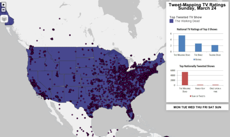
This series of maps were made with Leaflet, an open source web-mapping platform. Seven web-maps were created for each day of the week. In each of these, U.S. states were symbolized according to its most-tweeted TV show. Pie charts can be seen by clicking on each state displaying the three most tweeted TV shows per state. Finally, two bar graphs accompany each map: one showing the three most tweeted TV shows at a national scale, and another showing the three highest-rated TV shows at a national scale.
Overall, the results proved the initial hypothesis correct since there was a clear correlation between most-tweeted TV shows and official TV ratings. However, it is important to note that the results continue to offer some limitations. For instance, there are data limitations because only 1% of tweets are geolocated, and the age of people using Twitter ranges primarily from 18 to 29 years. For this reason, TV shows that are popular with older audiences may not be tweeted about but continue to receive high ratings. Future studies may be conducted in this newly-researched subject; yet, it is evident that tweets have a relationship with TV ratings in the United States, and these can be effectively mapped to find any relevant spatial patterns.