I’ve always had an interest in art, whether I am creating it or viewing someone else’s. Art galleries are my favourite place to explore visual art as I get to experience how another artist creates their work of art and how it relates to their own concept of art. Through high school and my undergraduate studies, Formal Visual Art Analysis has been an important part of my studies in Fine Arts.
Following our blog post from last week on Poetry Analysis, our next instalment in our writing genre series will be on Formal Visual Art Analysis.
What is Formal Visual Art Analysis?
Formal Visual Art Analysis is about the analysis of the construction of the work of art and the choices that the artist made to communicate their message or meaning within the work. The analysis often involves talking about the colour wheel and the elements and principles of design. Sometimes, a formal art analysis may seem like a list within a paragraph, but that is only because you have to connect the elements and principles to how the artist created their work. For example, you may begin with discussing the use of colour and line within the painting, then connect it to principles of design like pattern and emphasis. Or one paragraph may discuss the elements of design used in the painting, while the next paragraph will solely focus on the principles of design.
Elements of Design
The elements of design are the first steps in creating a work of art. They represent the basic elements or components of a work that can be isolated from the overall composition and meaning of the work of art. This resource explains in detail the different elements of design.
Colour

- Hue: colours from the colour wheel (i.e red, orange, yellow, green, blue, purple) and the relationships between the colours including complementary colours (colours opposite on the colour wheel) and analogous colours (colours located beside each other on the colour wheel)
- Intensity: the strength of a colour. Dull colours often elicit gloomy or serious emotions, while bright colours represent joy.
- Value: The brightness of a colour used to describe moods or locations. Dark colours can convey both a sense of foreboding as well as a nighttime or dark interior scene. Light colours describe feelings of joy and happiness as well as indicate light sources within the painting.
Line
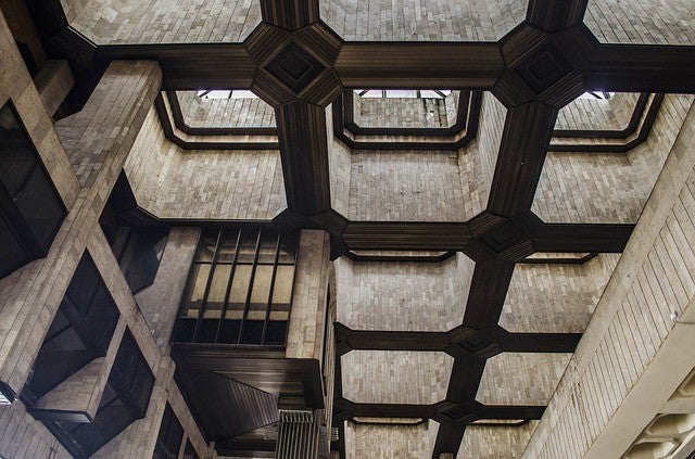
- Horizontal lines: give a sense of space and suggest a feeling of rest because the objects are parallel to the ground and the landscape seems to continue past the canvas.
- Vertical lines: give a sense of height and spirituality as the lines reach toward the heavens
- Perpendicular lines: communicate stability, permanence, and reliability
- Diagonal lines: convey a sense of movement and make the objects seem unstable
Texture
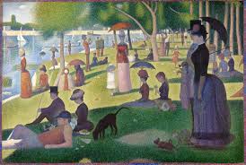
In the painting "A Sunday Afternoon on the Island of La Grande Jatte" by Georges Seurat, texture is depicted through his mechanical use of dots of paint instead of brushstrokes to create the images within the painting.
- Texture is shown through the artists’ brushstrokes and depicts how the object would feel in real life: soft, hard, rough, smooth, sharp, etc.
Shape and form

In this photograph, the circular top of the wine glasses creates repetition, while the organic shapes of the clear glasses blend into each other creating distortion within the image.
- Geometric shapes and forms: shapes such as circles, squares, triangles, rectangles, spheres, cubes, etc. Often manmade forms.
- Organic shapes and forms: usually irregular or asymmetrical forms. These forms are usually found in nature.
Space
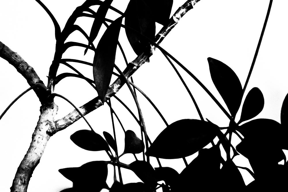
The blank space between the leaves and branches of the tree allows the sharp outlines of the leaves to stand out.
- Positive and negative space: positive space includes the space that an object occupies, and negative space is everywhere else.
- Three-dimensional space: the illusion of space is shown through perspectival drawing and shading.
Principles of Design
The principles of design show how the artist uses the elements previously mentioned to portray meaning in their work. Principles include balance, rhythm/movement, unity, contrast, emphasis, repetition and pattern, variety, and proportion. I will be focusing on a select few. These two resources explain in detail the different types of principles of design.
Balance
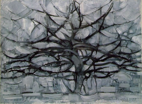
In the painting "The Grey Tree" by Piet Mondrian, the abstract tree creates a sense of stability, as if it is deeply rooted in the ground, due to the symmetrical quality of the image.
- Symmetrical balance: equal distribution of the objects in space. It conveys a sense of stability.
- Asymmetrical balance: unequal distribution of the objects in space. It conveys a sense movement and imbalance.
- Radial balance: the objects arranged radiate from a central point. It creates a sense of movement.
Movement
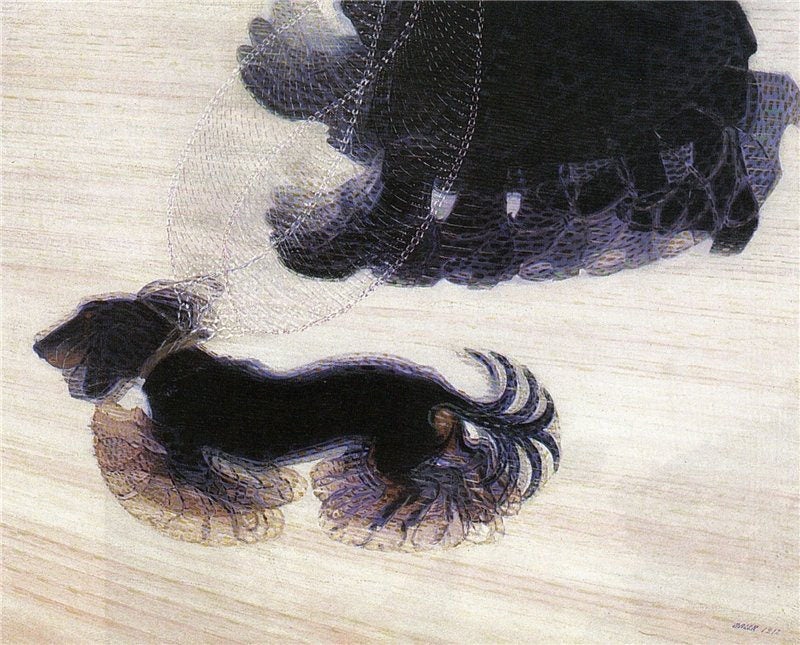
- The path the viewer’s eye takes as it goes around the painting, often focusing on certain focal areas. Also, the movement of the objects portrayed in the painting.
Emphasis
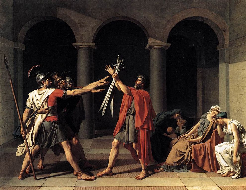
- An area that draws the attention of the viewer. This area can be different from the rest of the work of art in terms of size, colour, texture, shape, etc.
Pattern and Repetition
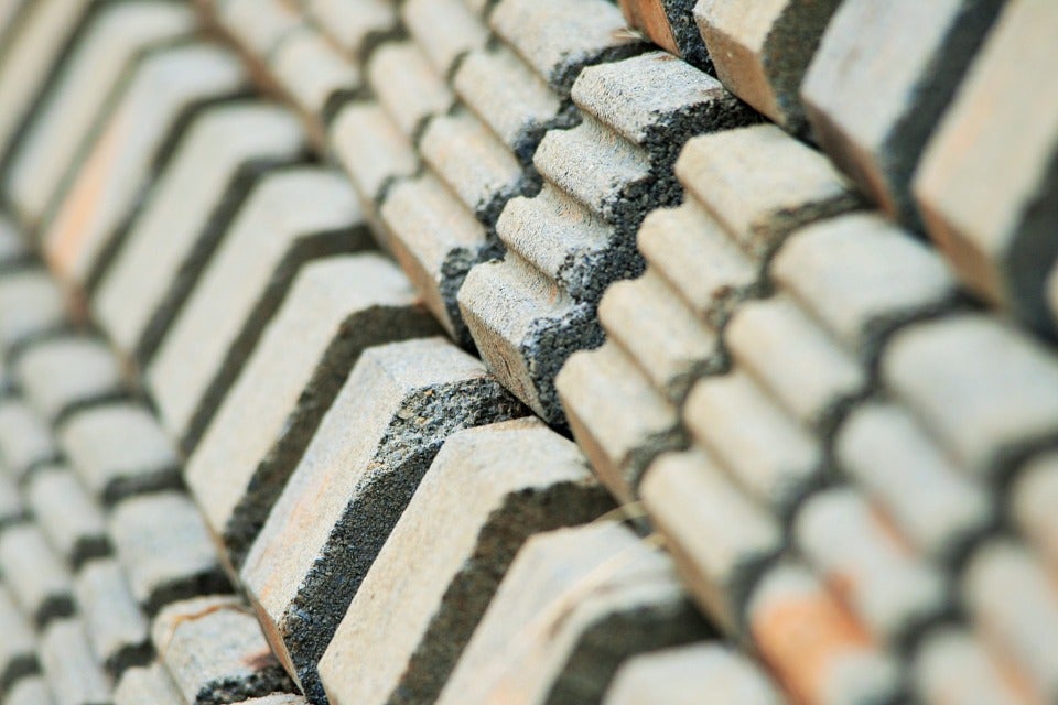
The repetition and pattern of the different sized bricks create a sense of unity to the photograph.
- Repetition of certain patterns, objects, or colours brings unity to the painting and allows it to be perceived as active.
Next time you’re in an art gallery, you can use these elements and principles of design to analyze the artwork!