It's always been in the back of our minds that the workbench and dashboard functionality in WCMS 2 wasn't exactly ideal. What was in the workbench, and what was in the dashboard? Why does it take so many clicks to create a piece of content? Why do you have to see things you'll never use? Why can't you change things to better suit your workflow?
So we changed all that in WCMS 3.
A bit of background
In a way, it was forced on us. The dashboard functionality we used in WCMS 2 was provided by Drupal core, and it was removed for Drupal 8. We were using the Workbench Moderation module to provide an editorial workflow (draft/needs review/published/etc.) and Workbench came along with that, but with content moderation becoming available in Drupal core, there wasn't really a lot of point to continuing to use the Workbench module for what little pieces of functionality it had that we liked.
We held onto this for a bit, as initial development didn't need us to have a replacement yet, but eventually we happened upon a module that provides dashboards that use the amazing layout builder functionality we have on the front end to give us a dashboard that can be customized by the end user to suit their needs.
What it looks like
In WCMS 3, the workbench is the dashboard, and vice versa. Call it whatever you like - you'll be referring to the same thing! You'll access it from the "My Dashboard" link in the "Workbench" menu.

It's called "My Dashboard" because it's your dashboard, and when you're the one logged in "my" means "yours".
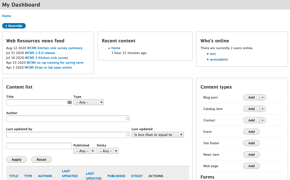
Once you're there, you'll see your own personal dashboard.

A preliminary look at how the default dashboard may appear.
What you can do with it
Some things may leap out at you right away. You can see that "add" is the default action for all of the content types, and some have a dropdown, which will offer additional actions such as access to taxonomies, and the content list is filterable and searchable.
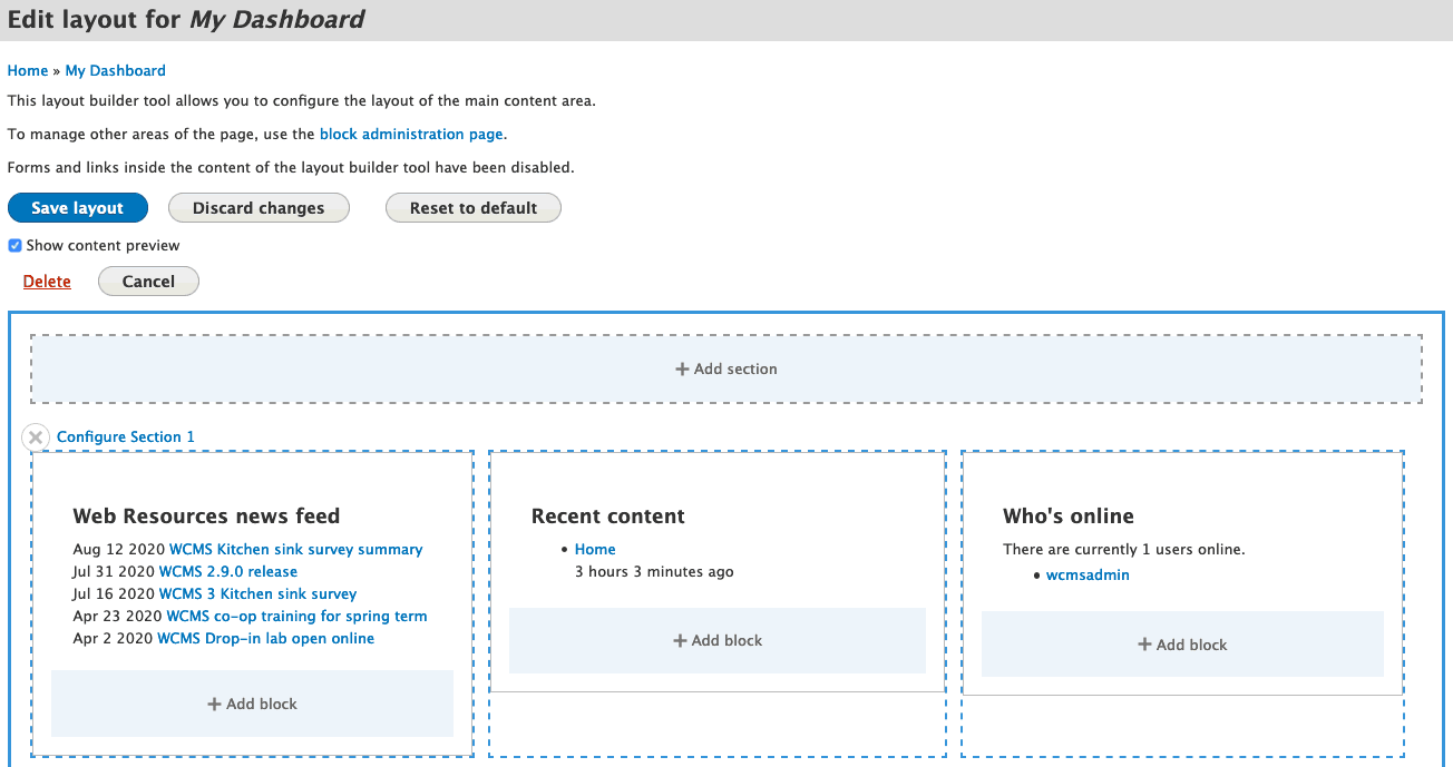
Other things are under the hood - do you see that "override" button in the top left? That lets you customize your dashboard. When clicked, you get a layout builder interface very similar to what you will see in content types, where you can move things around and add/remove/configure blocks and sections.

You can save your changes, discard them, or reset them to the system default. Cancelling just leaves things as they were previously. (Delete is an option only because this screen shot was taken as a system administrator.)
Being able to create sections means you can lay out the page however you want. If you'd rather have the content type listing at the top, spanning the whole width, you can add a 1-column section and drag the content type listing there.
Being able to add, move and remove blocks means you can put whatever you want on the page. Not concerned about who's online right now? Remove that block! Like them all but not the order? Move them around! Want the same block at the top and the bottom of the page for some reason? Add it again!
Finally, some blocks have additional configuration options that can make them even more powerful. For example, the content list can be configured to only show content from a specific type, or to default to a different sort, amongst other options. You can also configure the content and site management blocks to show only the items you're interested in. Combine that with the power to add multiple blocks of the same type, with the ability to change the title for each, and you can do things like put the most important things at the top and the less important things at the bottom, or spread the options out over multiple columns.

With the ability to use the same block multiple times, configured differently, you may want to separate out your content management into different groupings.
What else you can do...probably
Because it shares an "ecosystem" with the content blocks, we should be able to support all of those as well. Want to remind yourself of an event that's coming up? Put an event teaser on your dashboard! Want a bit of help text to explain to yourself how something works? Put a copy block on your dashboard to spell it out! It's a little rough around the edges right now, but we believe we'll be able to ship with a basic version of this functionality.
We've also considered that site owners (POCs) may want to provide their own default dashboards. While this is a bit too complicated to develop for launch, we've definitely got it in the back of our minds for something to consider once we get to the point where we're looking to build new features.
In conclusion
Just as layout builder opened up so many possibilities for page building, it's also opened up a ton of options for the dashboard, and allowed us to bring everything into one place. We hope you "love it to the end of time"!