Beautiful U: Waterloo: A Series in Celebration of the 60th Anniversary

Wednesday, September 27, 2017
by Wendy Fletcher, President and Vice-Chancellor, Renison

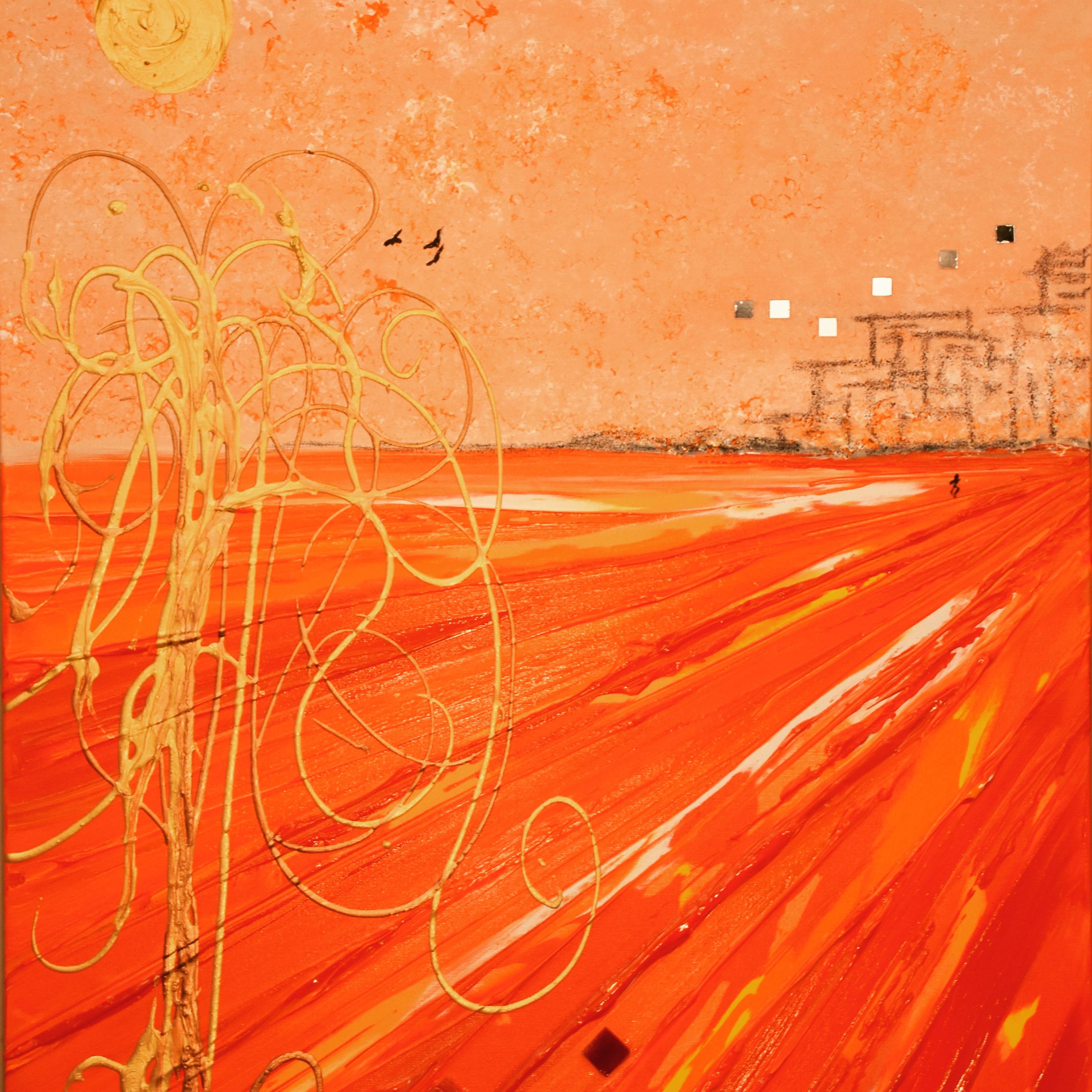
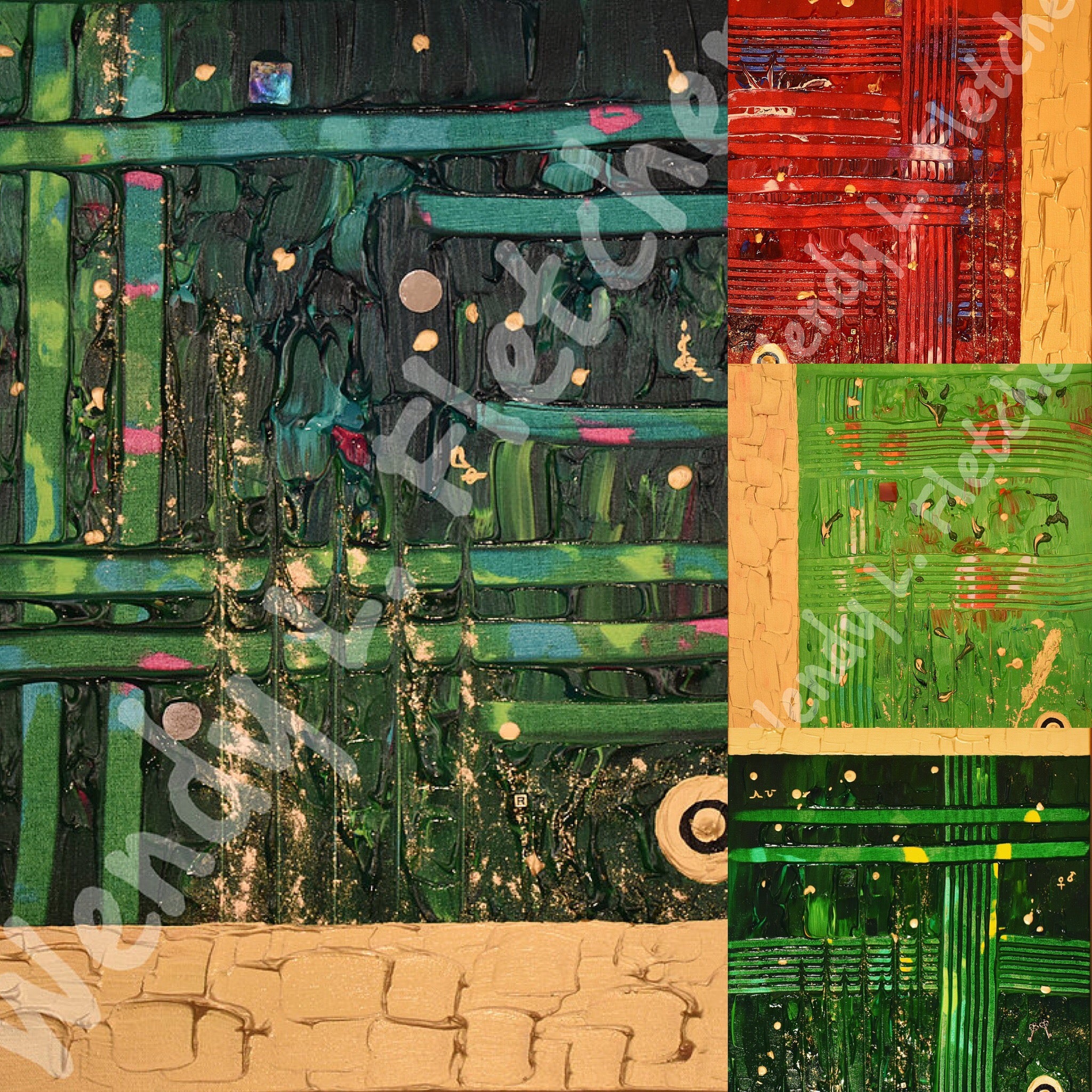
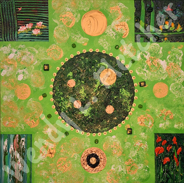
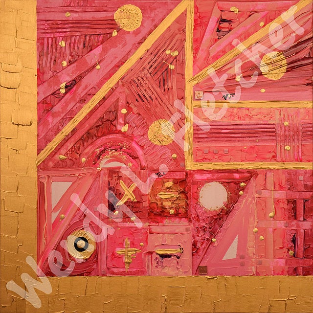
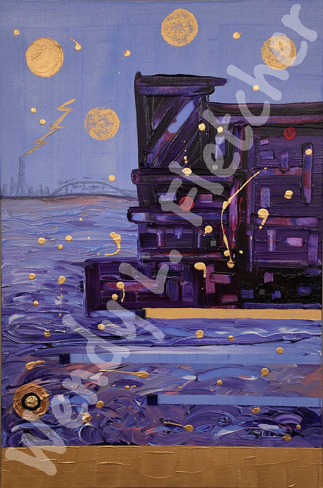
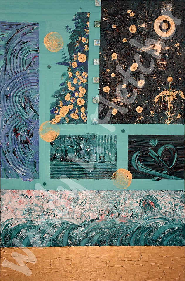
The paintings in this series are a collection of 11 canvases done in oil and acrylic with glass, charcoal, gold leaf and calligraphy ink: one canvas which gathers all of the branding colours of the University, one for each of the 6 faculties and one each- to be hung as a collective-- for the Affiliated and Federated Institutions of Waterloo.

Wendy Fletcher's Beautiful U: Waterloo

Wendy Fletcher's Beautiful U: Waterlo, blue

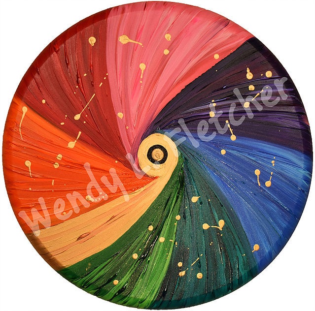
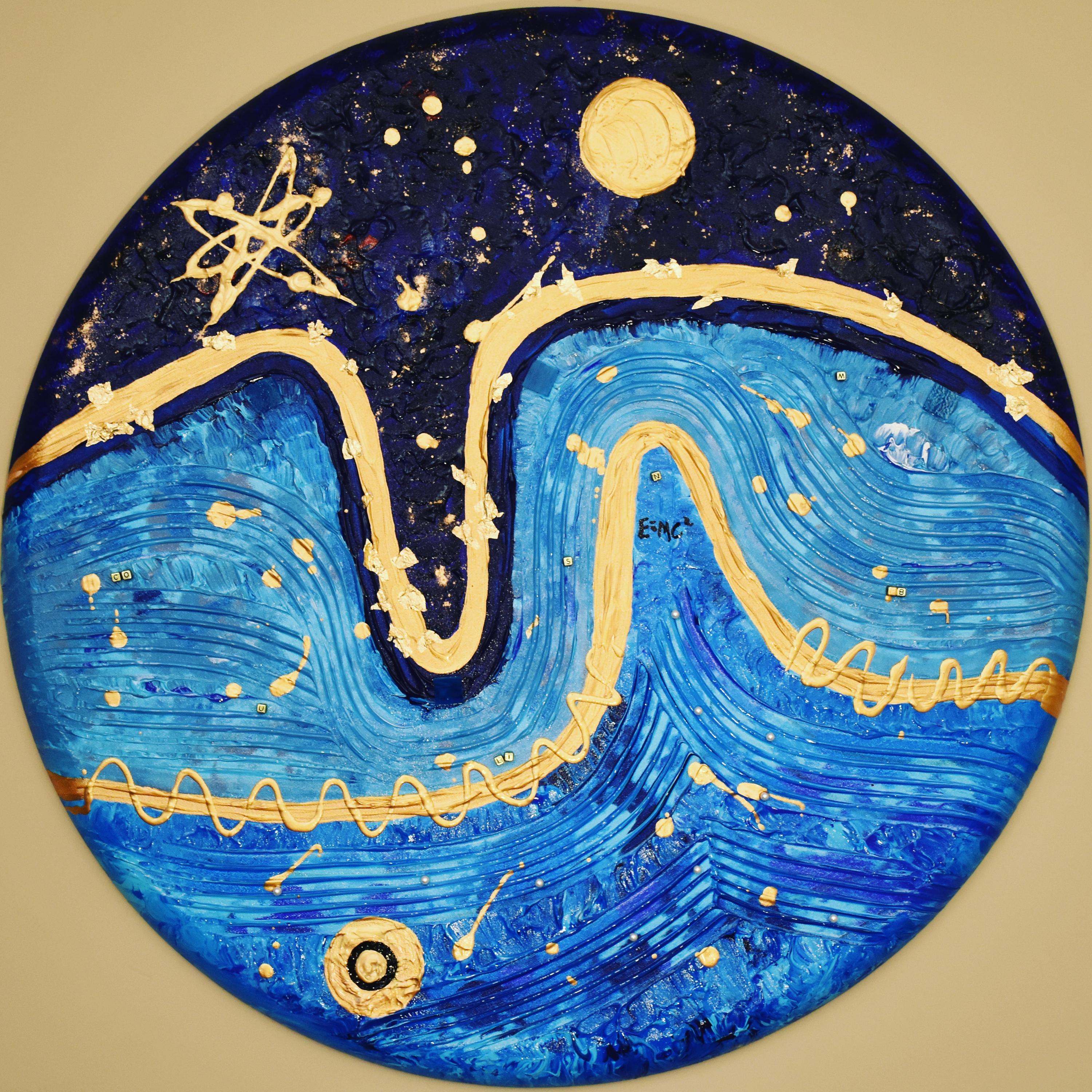
The style used in the paintings in known as neo-modern expressionism. The theory behind this genre of work is that meaning through art can be communicated most deeply through the use of colour and of symbol. You will notice in the paintings that the work is largely not representational. In this genre of work, representation happens only in deference to the symbiology it hopes to evoke.

The symbols are particular to each painting reflecting core aspects of the work in each faculty and college. Each painting needs to be read much like a, “Where’s Waldo” montage! Embedded in each painting are a variety of symbols which the viewer should read through the lens of their own experience of the discipline areas, in conversation with the artist’s lens- the story which is embedded in the paintings.

Wendy Fletcher's Beautiful U: Waterloo, Arts

Wendy Fletcher's Beautiful U: Waterloo

Each painting for me was a journey in coming to know this University and its particular but shared work in new ways. It is my experience that you cannot paint something with which you have no relationship. Moving more deeply into a reflective space, a deeper knowing with reference to the work of each of our parts has been very illuminating. The necessary contribution of each part to the project of a more liveable world has impressed itself upon me (did you know- math is in everything~?!).  Also, the common spirit which runs through us all became very evident to me as I worked. I would name that common spirit as vitality, dynamism: a very strong energy directed toward moving us forward- as society, as a world community- often by leaps and bounds.

Wendy Fletcher's Beautiful U: Waterloo, Environment

Wendy Fletcher's Beautiful U: Waterloo

I wanted to include in each painting a reference to our Gold and Black in a way which expressed something about the shared energy which I have come to know as Waterloo. I started first with painting the 60th anniversary logo; that didn’t quite work for me. I then tried the letters UW and the university crest- but that also did not quite express what I wanted to communicate. Then I hit upon it – the Roundel.

Wendy Fletcher's Beautiful U: Waterloo

Wendy Fletcher's Beautiful U: Waterloo

The Roundel is an international symbol- an international aeronautical symbol. Using colour in circular configuration, every country in the world has its own Rondel which identifies its aircraft in flight, to others. I had found my symbol: circular colour which communicates our brand- black and gold, but also our spirit- flight, internationalization, innovation: on its 60th anniversary the University of Waterloo is flying high. Yet we have only just begun to soar, only begun to reach. So much more will be possible, so much more is yet to come. And so I dedicate these paintings to the story come before, which has given us the possibility of our future together: Beautiful U: Waterloo.

View more of Wendy's works.