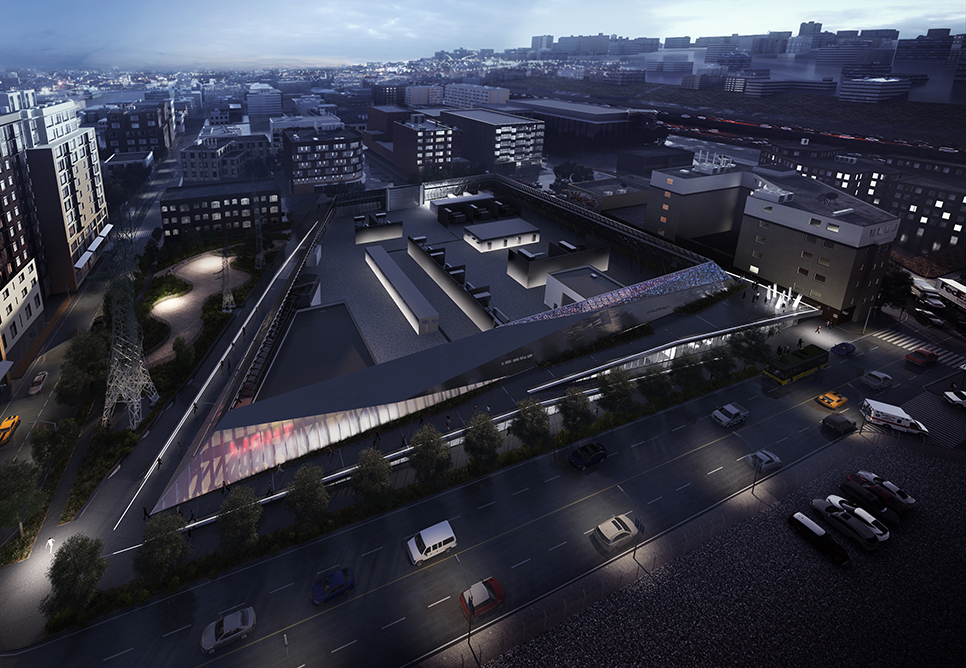
The Seattle City Light utility is preparing installation of the Denny Street substation. Why is this news? Because the new substation does not look like a substation. Behold!

(Courtesy NBBJ Architects.)
Normally, an electrical substation is somewhat of an urban embarrassment, a useful eyesore shuttered behind a chain-link fence.
However, the new substation is designed to be something of a community destination. The structure will include an off-leash dog track, a 3,800-sq. ft. community space programmed by Seattle Office of Arts and Culture, and a 2,900 sq. ft. learning center.
Aesthetically, the structure will be surrounded by a pedestrian walkway, fenced by inward-sloping walls (to lower its apparent profile), and feature metal and glass cladding that will glow at night. (Would that be a kind of advertisement for the product?)
In our Design & Society class, we talk about the prominence of honesty in modernism: Things are best designed when they do not disguise what they are. This station seems to have wrapped itself in the guise of a community center. Is that dishonest? A good idea? Or, have the architects innovated a new category of structure?