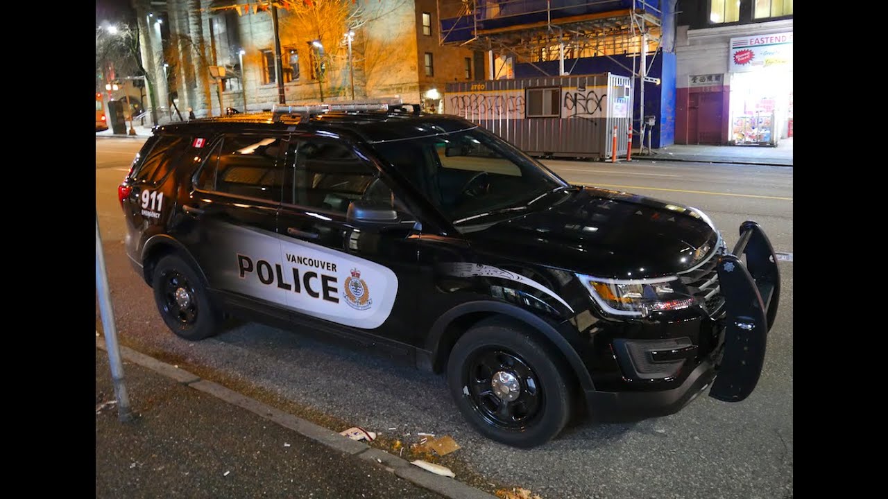
A recent article in the Toronto Star by Betsy Powell discusses controversies surrounding new colour schemes for Canadian police cars. A number of Canadian police forces have been changing from older schemes based on red, white, and blue to darker schemes based on grey, navy blue or black.
Critics contend that the new paint schemes are too aggressive or even militaristic in tone. Some argue that the cars appear intimidating and will thus deter people when they need to approach police for help. Another concern is that militaristic vehicles will send the wrong signal to the public, namely that the police are more like an armed occupation force than a public service.
Some defenders scoff at these concerns, saying that critics exhibit "chromophobia". Julian Fantino, former head of the Toronto and Ontario police forces, also dismisses concerns about associations such colour schemes may have:
We got that with the black shirts, this flurry of rhetoric about stormtroopers and back to the Nazi era, and on and on. In a way it was comical if not ridiculous.
In fact, Fantino claims that the new Ontario Provincial Police dress helped to reduce traffic fatalities in the province.
Also noted is the fact that many European police vehicles prominently feature yellow, a colour that makes them highly visible and is associated with safety.
There are at least two concerns here. The first is the technotonicity of the police cruisers' colouration. Are the new schemes too militaristic or just off-putting? Bill Stumpf, designer of the Aeron Chair, once argued that police uniforms are too scary, especially for children, and argued that they should be redesigned to look less like an arsenal.
The second issue is the brand that police services want to establish with the public. Should the police project an image of machismo or power, or receptivity and humility?
And, how much of a role can the colouration of police cars play in answering these questions?
 Vancouver Police Ford Interceptor/Youtube video screen capture.