Introduction
Since the last week of March 2025, the Computer Museum has been under renovations. In preparation for our Winter 2026 reopening, we decided to take the opportunity to create an updated brand.
Our goals for our new branding were as follows:
-
To be timeless
-
To be flexible
-
Have subtle nods to the past
-
Unify all Computer Museum material and exhibits
-
Tell the unique story of Waterloo
-
Work in harmony with the University’s existing brand
Creating this branding guide was my first big project as a Computer Museum Assistant, and in this blog post my aim is to give some insight into the process and thinking behind our new look.
Brand unpacking
Before creating any graphics, I first had to do my research. I began by looking into the University of Waterloo’s existing brand guidelines. While we wanted to differentiate ourselves and make the Computer Museum recognizable as its own entity, we also had to keep our connection to the University.
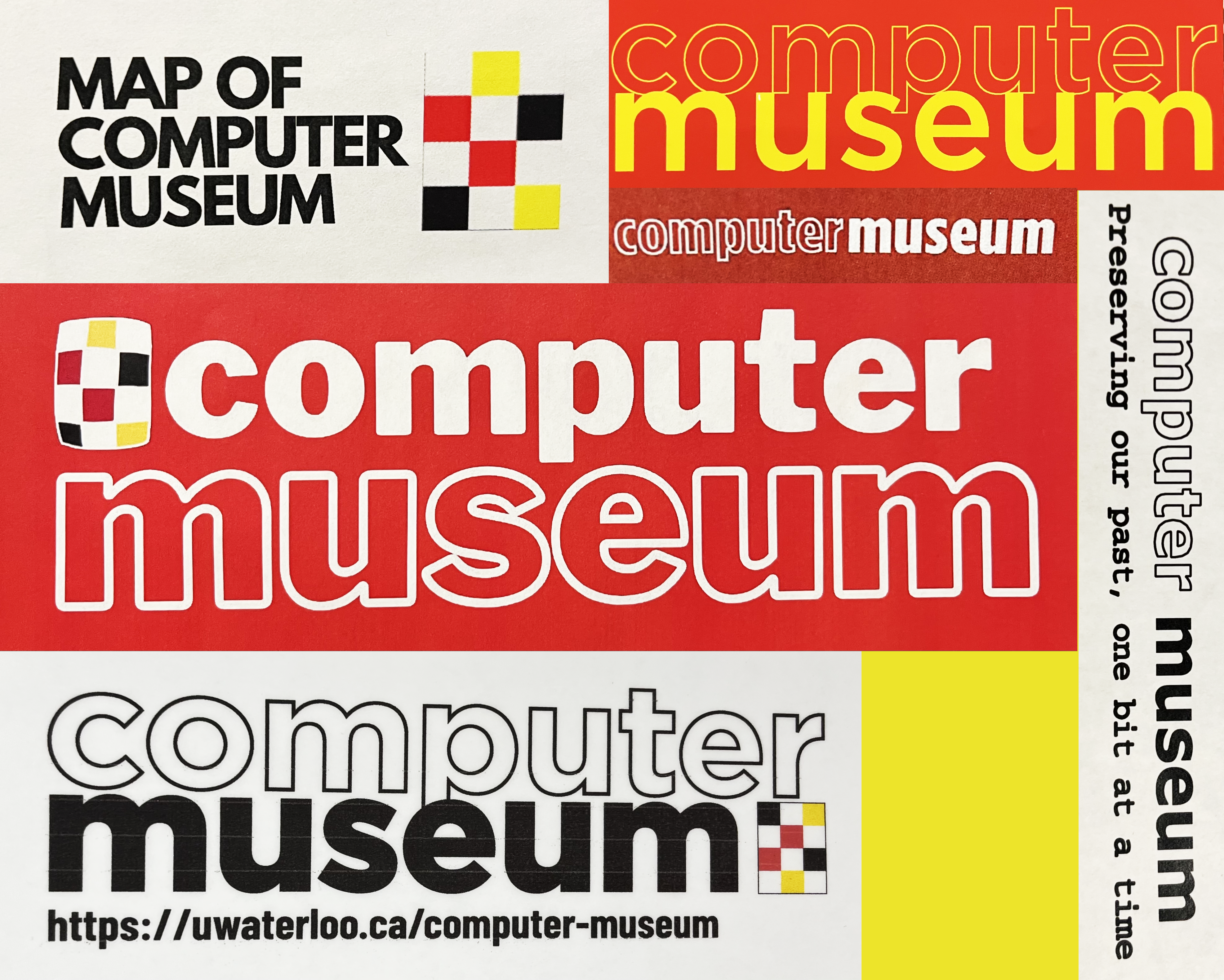
While trying to unpack our own branding, I found that it was quite inconsistent. We had a logo design that would often be followed by the text “computer museum” in all lowercase Gotham, but other than that, there were no guidelines. While their inclusion in signs helped associate exhibits around campus with us, they were not always present, which highlighted the need for a design guide for future co-ops and volunteers to follow.
Lastly, I looked towards other computer museums, as well as UW’s own Earth Sciences Museum. Not only did this help me identify successful patterns, but also gave me a general idea of how to differentiate ourselves while keeping a professional identity.
Our history
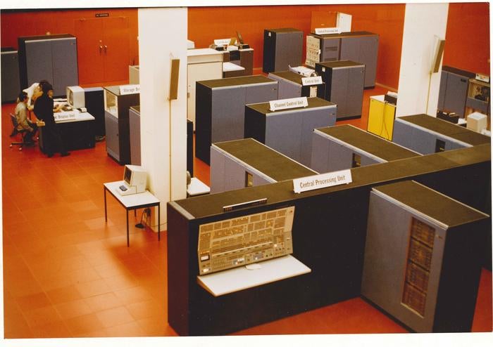
When developing a brand, it is always important to understand the entity’s history, and what makes it special. In our case, what made us different from other computer museums was our focus on Waterloo’s role in the development of computing. As this is in itself is quite broad, I focused on the key contributions by members of the University, and UW’s most well-known early computing accomplishments and characteristics. One iconic feature I took note of was the Red Room: a computing centre that was located in the Math and Computing Building (MC). The Red Room, known for its bright red coloration, was a crown jewel of the university and would capture the attention of visitors and students passing by the upper windows allowing anyone to take a look into the busy happenings inside.
Mood board
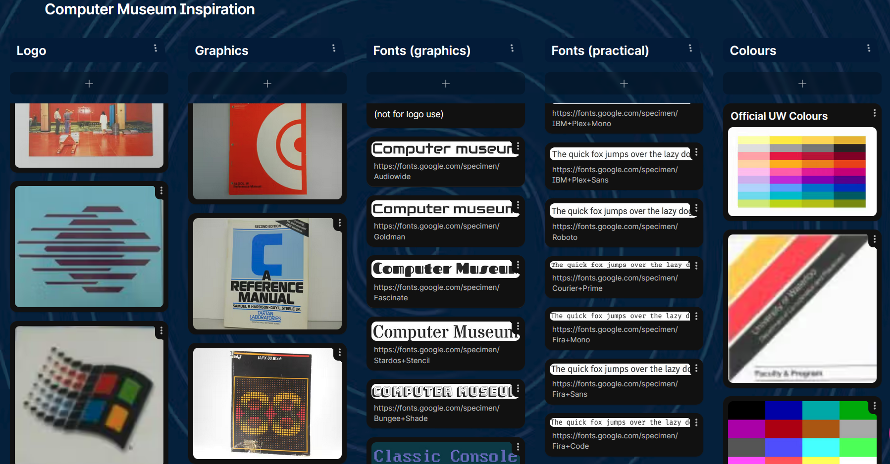
Once I gained a proper understanding of the Computer Museum and University’s branding and history, it was time to make a mood board. For this, I used Padlet.
While I did have inspirational material, such as photos of the Red Room, Computing Centre publications, old computer company logos and typefaces, I did not have a strong vision of what to design until I saw all the images together. With them all in one place, patterns emerged: strong geometric shapes and thick, blocky lines, in both logos and fonts. Having made these observations, I was finally ready to start designing.
Logo development
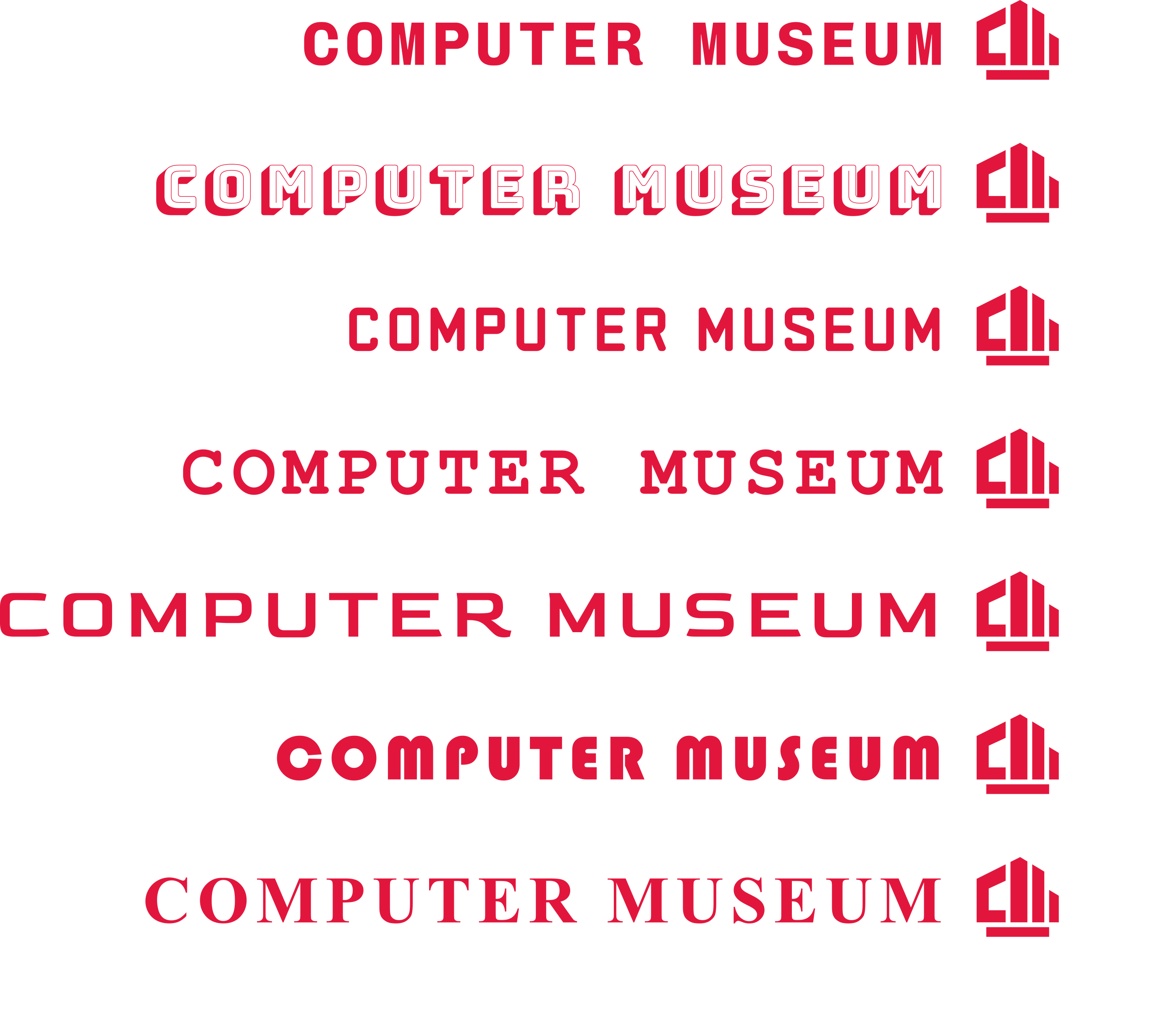
It was then time for the trickiest part of branding: the logo. There’s a lot of different aspects you have to keep in mind, such as scalability, recognizability and flexibility. Does it work well as a banner? Does it work as an icon on a website or mobile app? How does it look in greyscale or black and white? You have to take all of these in consideration, as well as overall trying to get the right feel, which is a subjective and trial and error process. To effectively design a logo, you must be able to combine your technical knowledge and intuition to truly create something memorable and usable for years to come.
Using the official UW colours, and different inspirations from the mood board, I sketched and created many quick raster mock-ups. The goal was to come up with as many ideas as possible, to get feedback and decide on the 5 more distinct directions. I found that I got hung up on using the red room in the design, and my ideas got stagnant. Once I got out of that box (or room), and started taking other inspirations, I was able to have more creative ideas and make progress once again.
Once I was happy with enough designs, they were sent to the Computer Museum community for feedback. In the end we settled on the logo that simultaneously used a CRT computer monitor and the MC building as inspirations, and hid the letters “C” and “M”.
Funnily enough, this idea came by me as I was working on some designs inspired by the math building, when I decided to incorporate an Atari ST monitor that happened to be sitting on my desk at just the right angle. While I wanted to avoid obvious symbolism, the combination and abstraction stood out as unique and recognizable.
Font development
Luckily, figuring out what font to use did not take as long as it did to develop the logo design, but that isn’t to say it doesn’t have its own challenges. There are seemingly endless varieties of fonts out there, although we did have some criteria to help narrow things down. Most importantly, we needed it to be open source so that future co-ops and volunteers could easily access them to create new graphics of their own. After going through a similar feedback loop process from designing the logo, we came up with some other criteria for the font. We didn’t want it to be sterile and bland, but also not overly decorative to date us. To achieve this, we decided to look for a monospacing font, that way, we would have a reference to the past (typewriters and early computing), without being too obvious. Using these criteria, we settled on Chivo Mono.
After our main logo font was decided, finding a practical font was easy as it just had to act as a compliment, while being readable and flexible, and Roboto perfectly fit those requirements.
Mockups
Before finalizing branding, it is always important to test it out to see how it works in practice with mockups. On the left, you may see an early mock-up made with an older version of our logo, and font guidelines.
As a base, I chose to redesign already existing materials with our branding, borrowing both from our own graphics as well as the UW Earth Science Museum’s. While working on these mock-ups, I naturally started to fall into a rhythm with the way I would style different elements. Once I started noticing some consistencies within the designs I felt were most successful, I could develop the brand guidelines: this would work as an outline for designing such as what fonts and graphics to use and where, so that future material produced by the Computer Museum would be consistent, no matter who was making it.
Final thoughts
In conclusion, design is a collaborative process, that takes a lot of time and testing. I learnt to stop getting hung up and attached to certain ideas and instead force myself to try new things and “start from scratch”, especially in the early stage of development. The first ideas are not always the best. For the most creative ideas, you have to challenge yourself to think deeper and out of the box, as it will allow you to get the more obvious ideas out of the way, and allow yourself to come up with some truly unique ones once you are all out of “easy” ones to use. It’s also important to receive feedback throughout the creative process: it’s easy to figure out what you don’t want, but hard to figure out what you want.
Creating this updating brand was a big project for me and it taught me a lot. I am proud to be able to show off what I have been working on for the few months I got the chance to work as a Computer Museum assistant.
I hope you all enjoy our new branding and continue to support our future endeavours!
About the Author
Anna is a Computer Museum Assistant for the Fall 2025 term, from the Global Business and Digital Arts program. She enjoys art and design, and has a particular interest in the history and development of 3D graphics, especially for the use in video games.