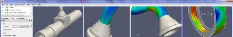
Supporting the degradation assessment of systems structures and components
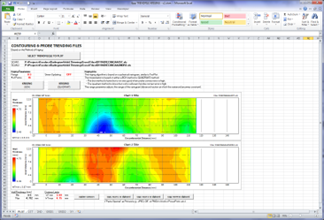
Nuclear utilities collect a vast amount of in-service inspection data as part of periodic inspection plans and the detailed assessment and monitoring of various degradation mechanisms, such as fretting, corrosion, and creep. The development of data visualization tools allows the consideration of all of the in-service inspection data in the analysis, and hence supports a more comprehensive degradation assessment of systems, structures and components (SSCs).
Key benefits
-
Effectively utilize all in-service inspection data in the assessment

- Provide a more comprehensive view of the degree and extent of degradation
- Help plan and prioritize future inspection and maintenance work by identifying key areas and locations for detailed monitoring
- Verify and guide on-going outage work
- Increase confidence and reliability of fitness-for-service (FFS) and other regulatory assessments
- Support life-cycle management (LCM) planning decisions with respect to component repair and replacement