Guest post by Anton Mosunov, Math Undergraduate Group (amosunov@uwaterloo.ca)

Recently I went to the conference on Education and Cognition that was held at McMaster University. I got a chance to attend a workshop on Digital Accessibility and would like to share with you some advice on how to make digital materials more inclusive. I am grateful to the hosts of the workshop, Jessica Blackwood and Kate Brown, for sharing many useful resources, some of which are listed at the end of this blog post. Make sure to check out their Accessible Digital Content Training ebook!
The goal of digital accessibility is to create digital content so that it could be used “by everyone… at the same time, with the same use, including and especially focusing on persons with disabilities.” (Kyle Shachmut, 2020) Educational content that was built without digital accessibility in mind may end up having various exclusive features, such as
- lack of embedded captions,
- lack of alternative text to visuals, or
- poor choice of colour contrast between foreground and background, which may not be accessible for people with low vision or those who are colour blind.
It is also important to differentiate digital accessibility from accommodation. While the latter is reactive, the former is proactive, as it assumes designer’s responsibility in creating accessible content. The hope here is that properly constructed content may eliminate the very need in requesting certain kinds of accommodation.
While it may be difficult to embed all principles at once, there are small steps that you can take to move towards a more inclusive design of digital materials:
- Describing graphics. Perhaps the most exclusive practice by far is not providing descriptions for the visuals. For example, this happens every time during a lecture or in a video the speaker says: “as is demonstrated in the graph below” or “take a look at the pie chart on the left”, without spending even a little time interpreting what is being displayed. Another example of this is when pictures appearing in the Learning Management System or in an electronic textbook lack alternative text. Thus, you can make your content more accessible simply by taking time to describe the graphics.
- +1 Formula. More generally, whatever format of digital material you use, consider enhancing it with a different sensory modality. For example, images can be enhanced with alternative text, videos — with captions, audio files — with transcripts, articles/handouts/essays — with accessible word documents or HTML versions, print texts — with audiobooks or accessible EPUBs. (Michelle Morgan, 2020)
- Choose your file format wisely. Be mindful how you create files and remember that certain formats are less accessible than others. For example, while it is possible to create accessible PDF’s, remember that exporting documents into this format without proper markup and in the absence of reviewing the exported PDF for digital accessibility, can lead to a non-accessible file being generated as a result.
- Structure your documents properly. Proper formatting of your document may increase its accessibility quite significantly. For example, in MS Word or in Google Docs, make sure to create headings/subheadings using proposed heading styles, as opposed to just writing your headings in bold, or underlining them, or writing them in larger font. While this may not be obvious on the surface, this practice contributes to the better structure your document, and makes navigating the document easier, especially for the users of screen readers. Similarly, you can improve the structure of your document through appropriate usage of lists, tables, links, etc. You can read more about proper formatting in University of Minnesota’s Start with the 7 Core Skills article.
In my lectures I am already practicing some of these, including recording videos with captions (MS Teams allows for that). One small step that I intend to take towards accessibility of my lectures/videos is to take time describing the visuals, e.g., by reading the formulas out loud. I am also planning to review our course notes and see if we can improve descriptions of the visuals there. I’d be interested in learning more about your practices in improving digital accessibility, so please share your experience by sending me an email.
Below are some additional resources that the hosts of the workshop shared with us that weren’t mentioned above:
- Websites to check for colour contrast: color.review and Colour Contrast Analyser
- Use YouTube to convert a script into a caption file (Auto-sync function)
- Convert caption files from SRT to VTT
- Convert caption files from VTT to SRT
- How to Meet Web Content Accessibility Guidelines (Quick Reference)
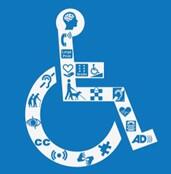
Image retrieved from https://www.visualisetrainingandconsultancy.com/wp-content/uploads/2018/05/Disability-symbol.jpg
