Concern details
Background information:
Courier employees are required to lift packages while sorting, picking-up and delivering packages. As a results of this material handling, courier employees are exposure to high loads and repetitive awkward postures. The package labels have been identified as a contributing factor to the increased risk of injury due to the material handling. Viewing the package labels is an issue in the courier sector because it results in visual fatigue and strain, awkward postures and/or double handling and lifting incorrect packages. Inability to read the labels causes many courier employees to position themselves awkwardly to read the label or double handle the box to test its weight instead of reading the weight written. The label at Courier Co. is thought to be insufficient in legibility or readability.
Evaluation:
Courier Co. has 12 different label formats. The labels include: First part of Postal Code, Service Type, Return address, Destination address, Barcode(s), Parcel weight, Reference number, Number of pieces, Shipper account number (see Figure 1). The formats differed based on: placement of the barcodes, postal codes, weight, etc., emphasis of the features, and colours. One label was analyzed in terms of comprehensibility, legibility, and readability through analyzing character sizes, font, colour, spacing and layout, and coding. In addition, courier tasks were reviewed and a Hub Manager was interviewed to obtain feedback and details regarding the label.
Based on the task analysis, it was determined that the aspect of the label used most frequently and by the most number of workers was the first part of the postal code. The destination address is also very widely used. It was also concluded that the least used aspects of the label include the barcodes, the customer account number, the reference number, and the return address. Workers generally do not use the weight of the packages and rather tend to “test” the weight by partially lifting it to judge the weight. This increases the amount of manual material handling experienced by workers.
Features of the main label include:
- Specific font was unable to be determined, however, it is a san serif font style. The font style is not one of the two preferred styles.
- The font was black on a white background. The colours follow guidelines
- Abbreviations that are used are standard or widely recognized.
- Almost all fonts are in capital letters, which does not meet recommendations.
- The character width is inconsistent and either exceeds or falls behind character width guidelines.
- The size of font does not follow guidelines.
- There are four areas of code: some with groups of three and five, no groups at all, separated by a hyphen, groups of three. (These codes are barely used by workers).

Design guidelines for labels:
- Mix of capital and lower case letters are easier to read than all capitals (e.g. Toronto ON vs. TORONTO ON) [1, 2].
- Borders around key information on the label (such as postal code and weight) may be used to improve readability [3, 4].
- Stroke width of each character should be about one sixth of the height of its own height [3, 4].
- Height of the characters should be based on the viewing distance from the eye. The average viewing distance for the couriers is anywhere from 33 cm (at eye level) to 172 cm (from ground) [4] (based upon the “arm’s length” measurements taken from the 95th percentile U.S. adult male anthropometrics). Furthest viewing distance for a user is when the user is standing with the package located on the ground. Based on anthropometrics, eye level of 95th percentile male is 172 cm [4]. Using character height equations [1, 5], the character heights should be 3-10 mm.
- Older and younger populations preferred larger print size than smaller print on consumer labels [6].Courier Co.
- Most legible fonts to use are Arial and Verdana. Least legible fonts are Times New Roman and Franklin [7].
- Certain colour combinations are best for legibility, like black print on a white or yellow background is most legible [3, 4].
- All-digit codes are preferred over alphanumeric codes [3, 4]. As well, strings of numbers should occur in groups of 3-4, all of the same type.
- Best to use all numbers rather than alphanumeric. Group in groups of 3-4 and make sure all within a group are of the same type (letter/number). Avoid using B, D, I, O, Q, Z as well as 0, 1, 8 for codes where possible [3, 4].
- Increase the size of the font for the package weights. In addition, add colour coding to indicate whether the box weights are low (green), medium weight (yellow), or heavy (red)
Prior to lifting, it is important to know the weight of the object being lifted so one can plan the lift. The box weight is usually “tested” before it is completely lifted. To eliminate this extra lifting, it is recommended to increase the size of the font for the package weights. In addition, to enhance the use of the package weight values and to inform the user of the risk level associated with the weight, a colour system of red, yellow, and green coding is proposed.
Evaluation summary:
The current courier label used by Courier Co. does not meet all label design guidelines. The character size, dimensions, and spacing of the label generally do not follow guidelines, and readability tends to be limited by the fact that all of the text is in capital lettering. The font size of the label is too small for the user population that will be viewing the label from the furthest distance. The font type was unable to be distinguished, though it was determined to be a sans serif font. Colour guidelines were met by having black text on a white background to ensure very good legibility.
Recommendations:
It is recommended that design guidelines be taken into consideration when (re)designing courier labels. Design changes to the labels would improve the comprehensibility, legibility and readability of Courier Co.’s package labels. The design guidelines discussed may also be applied to other labels.
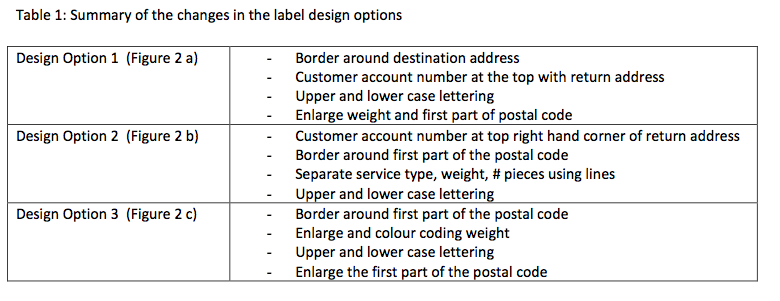
Based on the analysis of the tasks and the design guidelines, the following recommendations are provided: The aspects of the label that are most widely and frequently used should stand out. Thus, it is suggested to further emphasize and distinguish the first part of the postal code and the address line of the destination address. Font height of critical labels (first part of postal code and destination address) should increase to 10-13 mm. The size of the font used should be adjusted so that the character height is 9 mm to accommodate for the 95th percentile male reading the label from the furthest distance needed. The specific font size should be simple and should adhere to character and spacing guidelines. It is also recommended that the font size of the package weight be increased to allow users to easily locate the information in order to inform the worker of the weight before actually handling the package. Upper and lower case lettering should be employed to increase the readability of the label and the street line of the destination address should be further emphasized for users. A number of different label design options, which are based on these design recommendations, are provided in the Appendix. The features of the label design options are outlined in Table 1.
Conclusions:
Optimizing the label design will enhance legibility and readability which will reduce visual strain and fatigue as well as reduce the risk of musculoskeletal disorders by improving the lifting postures. Increasing the font size of the weight, will reduce the amount of manual material handling and double handling (i.e. less “testing” of the weight of the box). Furthermore, it is also likely that more legible labels may lead to faster sorting, which may speed up deliveries and potentially improve customer service as well as reduce the number of sorting mistakes.
References
-
Kroemer, K.H.E., & Grandjean, E. (1997). Fitting the task to the human: A textbook of occupational ergonomics, 5th ed. Routledge, UK: Taylor & Francis.
-
Gilmore, W., Gertman, D., & Blackman, H. (1989). User-computer interface in process control, a human factors engineering handbook. San Diego, California: Academic Press Inc.
-
Eastman Kodak Company. (2004) Kodak’s Ergonomic Design for People at Work (2nd Edition) (S. N. Chengalur, S. H. Rodgers, and T. E. Bernard, Eds.) John Wiley and Sons, Inc., New Jersey.
-
Eastman Kodak Company. (1983). Ergonomic design for people at work, Volume 1, workplace, equipment, and environmental design and information transfer. Belmont, California: Lifetime Learning Publications.
-
Konz, S & Johnson, S. (2000). Work design: Industrial ergonomics. Scottsdale, Arizona: Holcomb Hathaway, Inc.
-
Wogalter, M.S., & Vigilante, W.J. Jr. (2003). Effect of label format on knowledge acquisition and perceived readability by younger and older adults. Ergonomics, 46(4), 327-344.
-
Sheedy, J.E., Subbaram, M.V., Zimmerman, A.B., & Hayes, J.R. (2005). Text legibility and the letter superiority effect. Human Factors, 47(4), 797-815.


