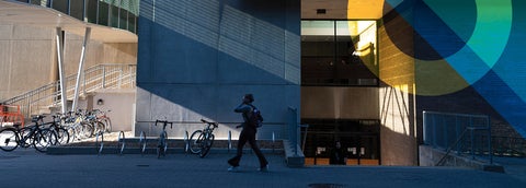
Banner images are full-width images used to highlight content on your site. Multiple images can be added per block, with the option to add links, big text, and small text.
Block setup
Elements to consider when building Banner images:
Multiple images
Up to 8 banner images can be used per block. Multiple Banner images will display in a carousel format. For ideal display, all banners should have the same dimensions.
Section layout
The layout of the section (width of the section) will affect the width of the Banner images. Consider using multiple sections for a different appearance.
Text allowance
Big text (optional, plain text, 128 characters max.)
Small text (optional, plain text, 255 characters max.)
Avoid images containing text
If necessary, center the text and use a colour contrast checker to ensure it meets accessibility requirements.
Image size
A minimum banner size of 1010 x 300 pixels is recommended. Banners that are narrower or wider than their location will automatically be scaled to fit.
Restrictions
No restrictions on where this can be used - top of the page, middle of the page, in a column; front page, inside page, any content type.
Block examples
Text overlay styles
There are four text alignment options available for Banner images:
- The default black and gold colour theme has been used
- An optional link has been added to the image, indicated by the image darkening when hovered over
- The image darkens to highlight the white text
- An optional indicator on the banner shows its affiliation with the Faculty of Arts
- The image lightens to highlight the black text
- The image has been placed within a Full width section
- A black and white background has been used to highlight the text
- The image has been placed within a Full width section
