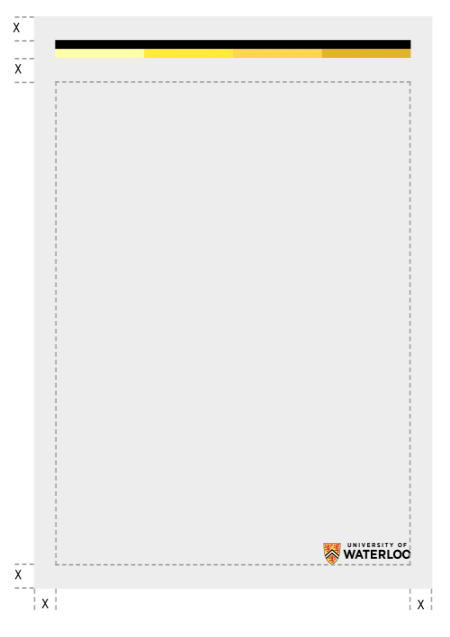
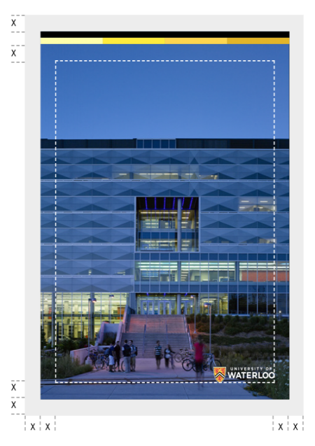
To create a visual system with a consistent look, general principles have been created as a starting point to help you determine the sizing of margins, the colour bar and the logo across all collateral.
The colour bar should appear at the top of all layouts, while the logo should appear at the bottom, within the defined margins.
Sizing
The canvas should be divided into 24 across its longest side to determine “x” (the minimum size of the margin).
The thickness of the colour bar should be 3/4x.
The size of the logo is determined by the height of the shield. For the horizontal logo and faculty logos, it should be equal to 1. For the vertical logo, it should be equal to 1.25x.
Colour bar
Use the minimum size to ensure legibility in communication material.
| Application | Minimum size |
|---|---|
| 5.5 mililmeters (mm) or 20 pixels (px) high | |
| Digital- desktop | 18 px high |
| Digital - tablet landscape | 16 px high |
| Digital - tablet portrait | 14 px high |
| Digital - mobile | 10 px high |
Logo
Sizing of the logo should be in proportion to the thickness of the colour bar to create a unified look across collateral. Ideally, if the logo is resized, the thickness of the colour bar should change in proportion and vice versa.
In scenarios where the colour bar may become too thick relative to the size of the logo, the logo can be scaled up independently of the bar, providing that it maintains a relative relationship to “x.”
Canvases
Click to view full image
Portrait canvas
A sample portrait canvas divided into 24 equal parts. Where 'x' equals the value of 1 part.
Landscape canvas
A sample landscape canvas divided into 24 equal parts. Where 'x' equals the value of 1 part.


