Last updated: August 21, 2025
Colour is central to the Waterloo brand.
By using colours consistently and appropriately, we build awareness, recognition and trust with our audiences. This page explains how to properly apply the University and faculty colour palettes.
About the Waterloo colours
The full Waterloo colour palette contains a total of ten colours with associated hues and shades, selected to follow best practices in design, readability and accessibility. The primary colours are the most frequently used, while the various shades provide more flexibility across applications.
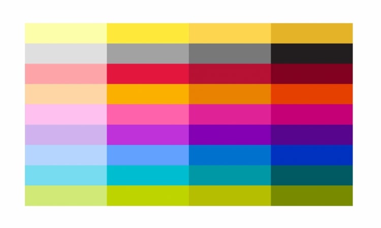
- The main University colours, which consist of multiple shades of yellow, shades of black, and white. (gold/yellow, black/grey, white)
- The six faculty colours of the six faculties (orange, pink, purple, blue, teal, green).
- The school and satellite campus colour (red).
Colour levels
Within the palette, there are four levels of each colour. These levels offer various shades and hues for flexibility across applications.

Each colour in the palette has four levels.
Accessibility
The primary colour is typically level 3 for print and level 4 for digital. Using these levels wherever appropriate ensures we meet colour contrast requirements mandated by the Accessibility for Ontarians with Disabilities Act (AODA).
University palette
Updated November 2023.
Where appropriate, you can combine the main University colours with faculty colours.
For generic University communications, you can incorporate faculty colours in addition to the University colours, as long as you use two or more faculty palettes in the layout.
If the University communication is specific to a single faculty, you can use the University palette in conjunction with a single faculty palette.
Sample application
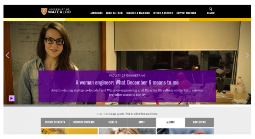
This sample shows the University colour palette and colour bar used in conjunction with the Faculty of Engineering palette. In this case, the content in purple is from the Faculty of Engineering.
Gold/Yellow
| Colour | PMS | CMYK | RGB | HEX | Accessible Colour Combinations |
|---|---|---|---|---|---|
|
Level 1
|
600 |
1 0 44 0 |
242 237 168 |
#F2EDA8 | |
|
Level 2
|
Yellow |
0 0 100 0 |
250 225 0 |
#FAE100 | |
|
Level 3 (primary)
|
122 |
0 9 80 0 |
254 211 76 |
#FED34C | |
|
Level 4
|
124 |
0 29 100 1 |
235 171 0 |
#EAAB00 |
Black/Grey
| Colour | PMS | CMYK | RGB | HEX | Accessible Colour Combinations |
|---|---|---|---|---|---|
|
Level 1
|
15% Black | 0 0 0 15 | 223 223 223 | #DFDFDF | |
|
Level 2
|
35% Black | 0 0 0 35 | 162 162 162 | #A2A2A2 | |
|
Level 3
|
50% Black | 0 0 0 50 | 120 120 120 | #787878 | |
|
Level 4 (primary colour)
|
Black | 0 0 0 100 | 0 0 0 | #000000 |

White
| Colour | PMS | CMYK | RGB | HEX |
|---|---|---|---|---|
|
White
|
White | 0 0 0 0 | 255 255 255 | #FFFFFF |

Faculty palettes
Arts - orange
Use the colour orange to identify content and communications from the Faculty of Arts.
In order to meet AODA colour contrast requirements, there is a digital variation for level 4 orange, indicated in the table below.
|
Colour |
PMS | CMYK | RBG | HEX | Accessible Colour Combinations |
|---|---|---|---|---|---|
|
Level 1
|
155 |
0 13 35 0 |
239 210 171 |
#EFD2AB | |
|
Level 2
|
7408 |
0 20 98 0 |
247 191 10 |
#F7BF0A | |
|
Level 3 (print primary colour)
|
144 |
0 49 100 0 |
237 140 0 |
#ED8C00 | |
|
Level 4 (print only colour)
|
7599 |
1 85 92 19 |
|||
|
Level 4 (digital primary colour)
|
NA | NA | 217 63 0 | #D93F00 |

Engineering - purple
Use the colour purple in communications pertaining to the Faculty of Engineering.
| Colour | PMS | CMYK | RBG | HEX | Accessible Colour Combinations |
|---|---|---|---|---|---|
|
Level 1
|
264 |
23 34 0 0 |
194 168 240 |
#C2A8F0 | |
|
Level 2
|
7441 |
45 71 0 0 |
180 93 203 |
#A05DCB | |
|
Level 3 (print primary colour)
|
2081 |
52 70 0 0 |
134 93 164 |
#865DA4 | |
|
Level 4 (digital primary colour)
|
2597 |
82 100 0 4 |
93 0 150 |
#5D0096 |
Environment - green
In Faculty of Environment communications, use the colour green.
| Colour | PMS | CMYK | RGB | HEX | Accessible Colour Combinations |
|---|---|---|---|---|---|
|
Level 1
|
372 |
15 0 53 0 |
212 237 152 |
#D4ED98 | NA |
|
Level 1 (digital)
|
NA | NA | 218 245 130 | #DAF582 | |
|
Level 2
|
381 |
18 0 99 0 |
206 222 0 |
#CEDE00 | |
|
Level 3 (print primary colour)
|
390 |
20 0 100 8 |
132 191 0 |
#B6BF00 | |
|
Level 4 (print only colour)
|
4215 |
55 18 77 41 |
|||
|
Level 4 (digital primary colour)
|
NA | NA | 96 112 0 | #607000 |

Health - teal
To distinguish content and communications from the Faculty of Health, use the colour teal.
| Colour | PMS | CMYK | RGB | HEX | Accessible Colour Combinations |
|---|---|---|---|---|---|
|
Level 1
|
635 |
32 0 1 0 |
164 219 247 |
#A4DBF7 | |
|
Level 2
|
3115 |
70 0 13 0 |
0 194 222 |
#00C2DE | |
|
Level 3 (print primary colour)
|
320 |
100 0 36 1 |
0 156 168 |
#009CAB | |
|
Level 4 (digital primary colour)
|
5473 |
86 24 33 43 |
17 94 107 |
#115E6B |
Math - pink
Use the colour pink to represent content and communications from the Faculty of Math.
| Colour | PMS | CMYK | RGB | HEX | Accessible Colour Combinations |
|---|---|---|---|---|---|
|
Level 1
|
2365 |
3 29 0 0 |
239 187 240 |
#EFBBF0 | |
|
Level 2
|
2038 |
0 72 1 0 |
239 96 173 |
#EF60AD | |
|
Level 3 (print primary colour)
|
225 |
4 90 0 0 |
223 26 160 |
#DF1AA0 | |
|
Level 4 (digital primary colour)
|
234 |
16 100 0 17 |
162 0 110 |
#A2006E |
Science - blue
Use the colour blue to identify Faculty of Science communications and content.
| Colour | PMS | CMYK | RGB | HEX | Accessible Colour Combinations |
|---|---|---|---|---|---|
|
Level 1
|
2708 |
25 12 0 0 |
185 205 251 |
#B9CDFB | |
|
Level 2
|
652 |
52 27 0 1 |
126 156 204 |
#7E9CCC | |
|
Level 3 (print primary colour)
|
285 |
90 47 0 0 |
0 114 218 |
#0072DA |
|
|
Level 4 (digital primary colour)
|
661 |
100 81 0 13 |
0 53 153 |
#003599 |
Schools and Satellite Campuses — Red
Use the colour red to identify University of Waterloo schools and satellite campuses. Alternatively, you can use the main University colours or the affiliated faculty colours, as long as you choose one approach and use it consistently.
| Colour | PMS | CMYK | RGB | HEX | Accessible Colour Combinations |
|---|---|---|---|---|---|
|
Level 1
|
7422 |
0 18 2 0 |
244 206 223 |
#F4CEDF | |
|
Level 2
|
1925 |
0 100 52 0 |
225 0 84 |
#E10054 | |
|
Level 3
|
200 |
0 100 76 13 |
187 15 51 |
#BB0F33 | |
|
Level 4
|
188 |
5 96 56 54 |
120 36 52 |
#782434 |
Affiliated and Federated Institutions of Waterloo
The affiliated and federated institutions of Waterloo use the yellow colour bar in combination with their own brand colours.
Conrad Grebel University College
Use Conrad Grebel red in communications for the university college
| Colour | PMS | CMYK | RGB | HEX | Accessible Colour Combinations |
|---|---|---|---|---|---|
|
Conrad Grebel red
|
1797 |
0 92 72 6 |
203 51 64 |
#CB3340 |
Renison University College
Use Renison green, red and gold in content and communications for Renison University College.
| Colour | PMS | CMYK | RGB | HEX | Accessible Colour Combinations |
|---|---|---|---|---|---|
|
Renison green
|
349 |
85 3 91 44 |
7 107 59 |
#076B3B |
|
|
Renison red
|
179 |
0 88 85 0 |
224 60 57 |
#E03C39 | |
|
Renison gold
|
467 |
11 19 42 2 |
212 190 151 |
#D4BE97 |
St. Jerome's University
When designing St. Jerome’s University communications, use St. Jerome’s green and gold
| Colour | PMS | CMYK | RGB | HEX | Accessible Colour Combinations |
|---|---|---|---|---|---|
|
St. Jerome's green
|
343 |
87 13 72 56 |
16 87 66 |
#105742 | |
|
St. Jerome's gold
|
139 |
0 48 100 26 |
175 110 5 |
#AF6E05 |
United College
Use United College's blue for communications relating to the college.
| Colour | PMS | CMYK | RGB | HEX | Accessible Colour Combinations |
|---|---|---|---|---|---|
|
United College blue
|
2190 C |
61 5 0 0 |
85 183 240 |
#55B7F0 |


