The pieces will be exhibited at a gallery in Hong Kong, then auctioned on November 24, with proceeds going toward UWaterloo scholarships.
"It's a very generous initiative on Wendy's part," said St. Paul's Principal Rick Myers.
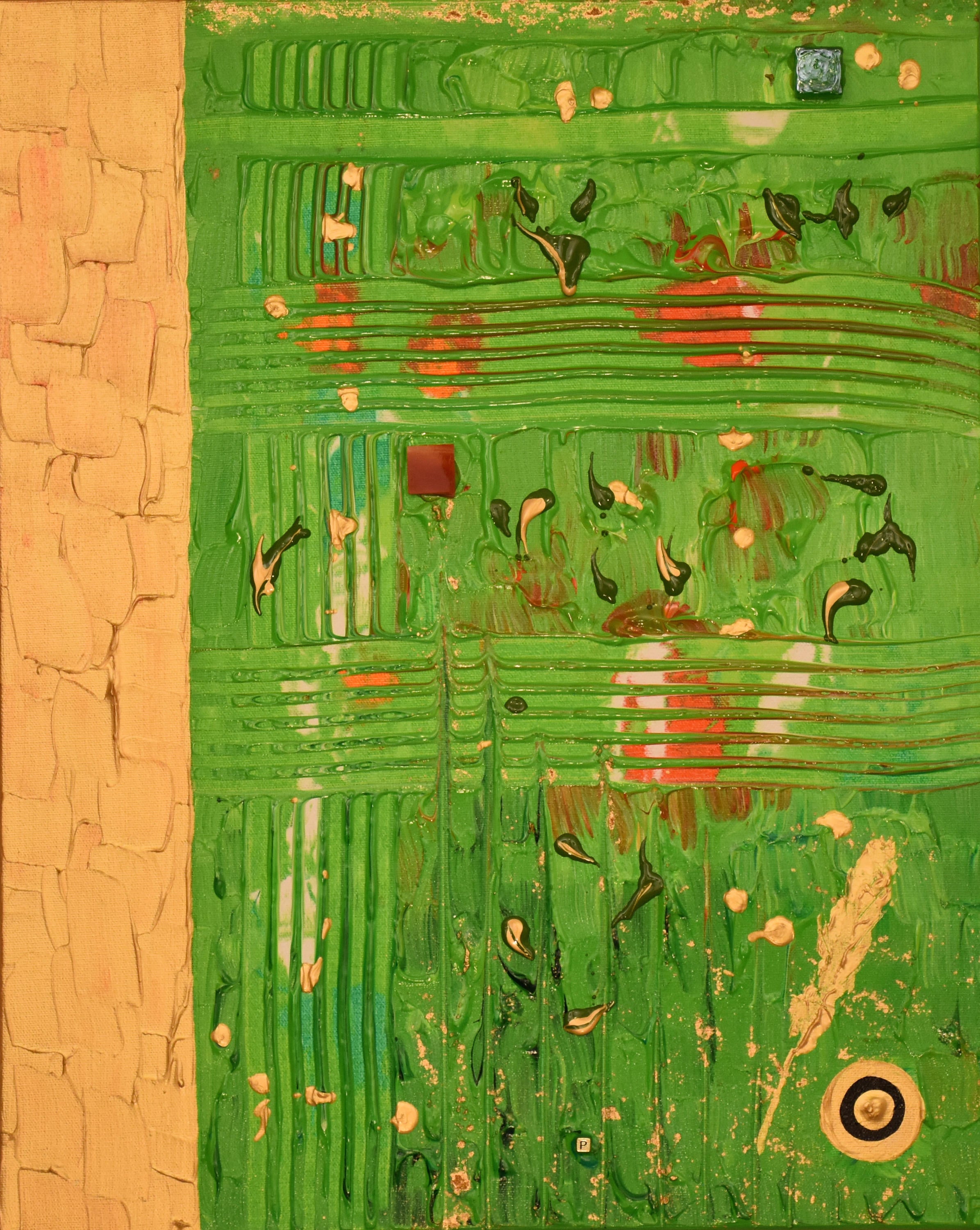
Wendy Fletcher describes the collection in this way:
"The style used in the painting is known as neo-modern expressionism. The theory behind this genre of work is that meaning through art can be communicated most deeply through the use of colour and of symbol. You will notice in the painting that the work is largely not representational. In this genre of work, representation happens only in deference to the symbiology it hopes to evoke.
"Three of the four colleges use green as their signature colour. The shades of green I used to represent St. Paul’s are particular to this canvas. They are young and bright implying renewal and vitality! St. Paul’s sits at the beginning of a whole new chapter in its programmatic and institutional life. In a desire to capture the commitment to the environment and to Indigenous life which define St. Paul’s, I included green leaves and gold feathers. A subliminal cross etched in the background indicates the United Church heritage. Green glass represents vision and transparency – core dimensions of the ethic of your current leadership.
"I wanted to include in each painting a reference to ourBlack and Gold in a way which expressed something about the shared energy which I have come to know as Waterloo. I started first with painting the 60th anniversary logo; that didn’t quite work for me. I then tried the letters UW and the university crest – but that also did not quite express what I wanted to communicate. Then I hit upon it – the Roundel.
"As you may be aware, the Roundel is an international symbol – an international aeronautical symbol. Using colour in circular configuration, every country in the world has its own Roundel which identifies its aircraft in flight, to others. I had found my symbol: Circular colour which communicates our brand- black and gold, but also our spirit- flight, internationalization, innovation: On its 60th anniversary, the University of Waterloo is flying high. And yet we have only just begun to soar, only begun to reach. So much more will be possible, so much more is yet to come. The work and leadership of St Paul’s, by way of its commitment to Indigenous life and a thriving globe through environmental health, will be a key dimension of that future."
Below are the other three Affiliated Institution pieces:
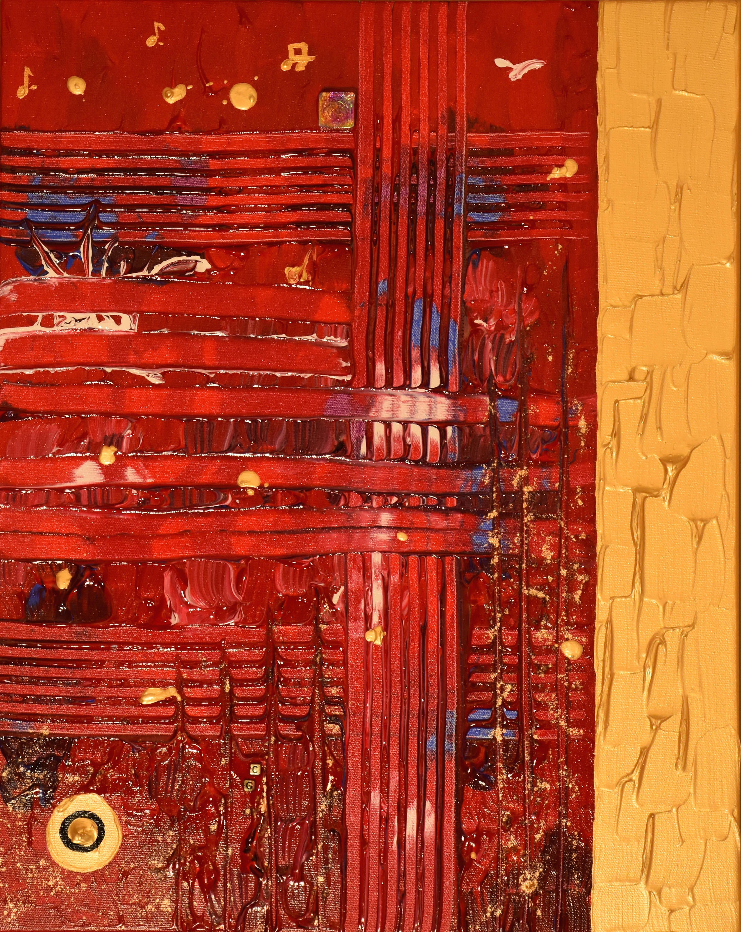
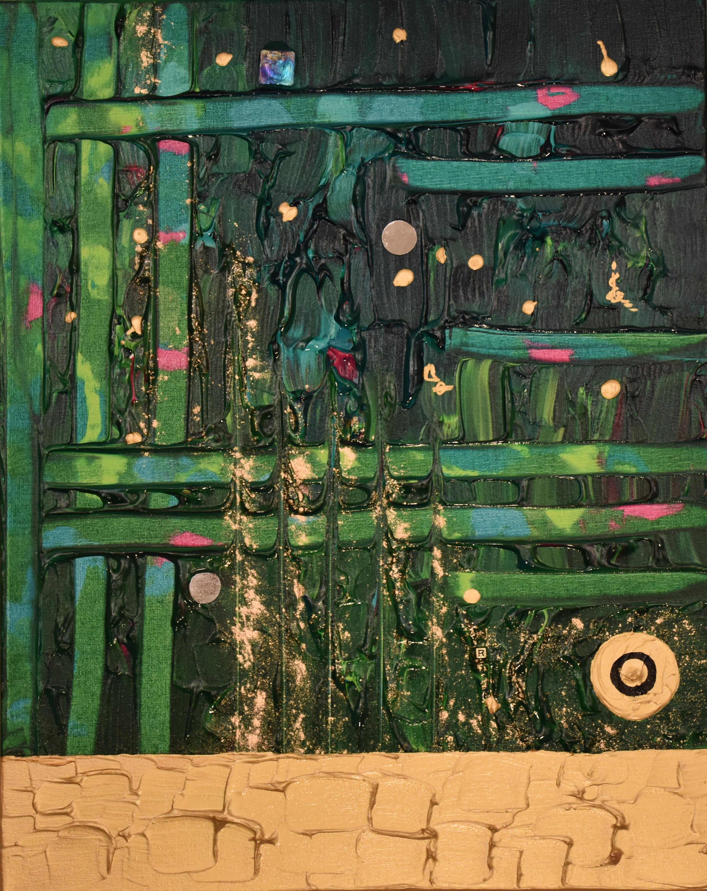
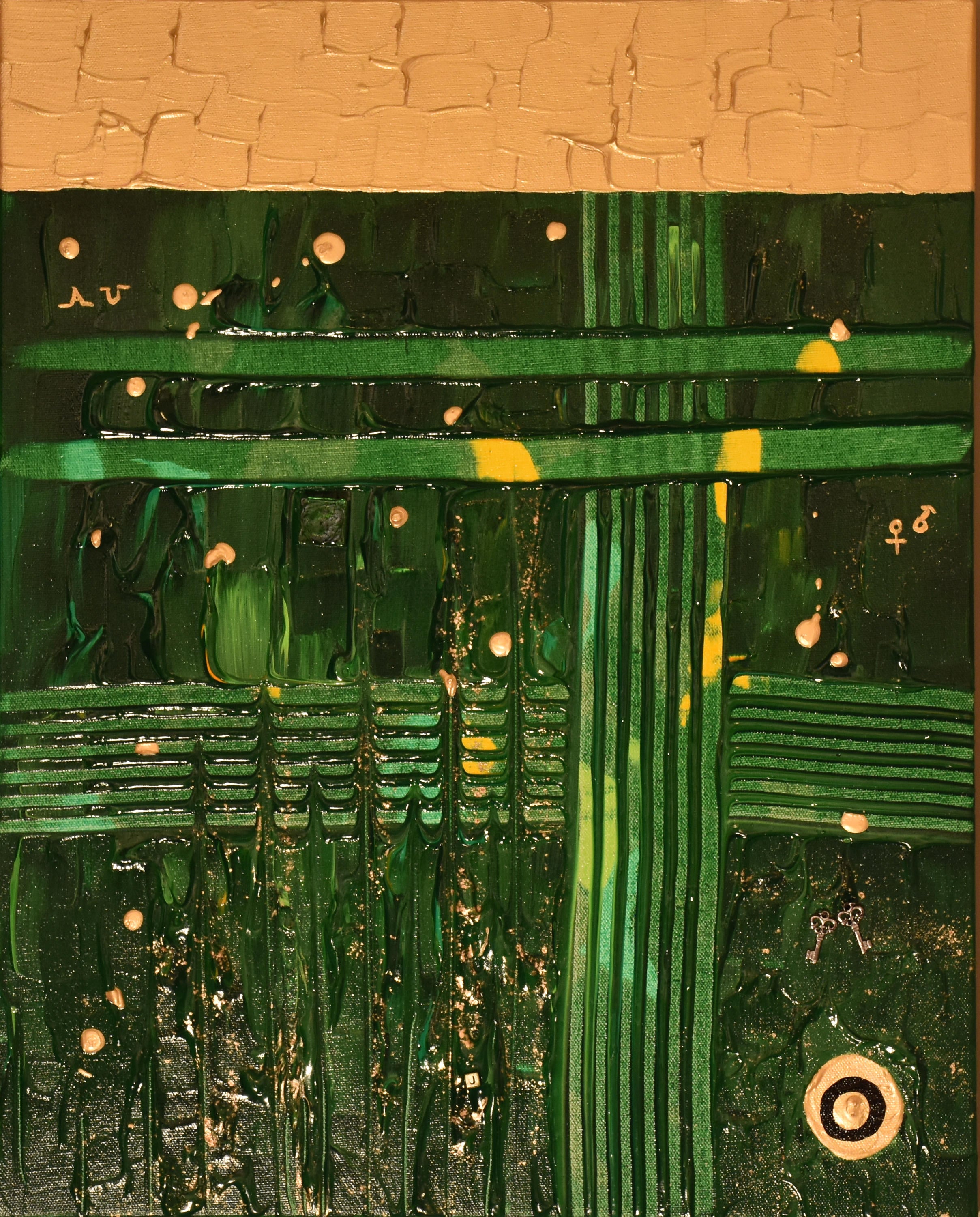
From l to r: Conrad Grebel, Renison, and St. Jerome's