The brightest choose Waterloo. That’s because being original and innovative infuses everything we do.
The imagery we use reflects that mentality too. Imagery shows the world who we are as a brand. When designed with our values in mind, it has the power to evoke strong emotions, create a mood, strengthen an idea, and even say a thousand words.
Key considerations
When selecting imagery, keep in mind the following guiding principles that apply to any image style, from photography to illustration:
- Keep it original — Always avoid generic imagery. If it looks like something you pulled from the first few pages of a Google image search, it isn’t right for Waterloo.
- Immerse viewers in the experience — Frame imagery in a way that makes viewers feel part of the action. That means no staged poses or extreme angles.
- Highlight real-world impact — Choose brand imagery that clearly illustrates how Waterloo is making a positive difference in the world.
- Illustrate high-level ideas — Illustrations should focus on supporting the story by communicating compelling ideas rather than technical details.
- Experiment with fresh approaches — Try incorporating cutting-edge imagery techniques where appropriate. A fresh approach can communicate innovation just as much as a story’s content.
Image style
Our image style incorporates photography, generative renders, illustration, infographics and symbols. We use these styles both independently and in combination to create compelling brand visuals.
Expand the following sections to view guidelines for using each type of image.
Quick links
Photography
The most powerful photography stops viewers in their tracks. That’s because it communicates a wholly original point-of-view, making audiences think, question and want to learn more.
The goal of brand photography is to convey messages about who we are, what we do and why we matter, capturing our tone and personality and making our stories shine more vividly. Follow these guidelines when capturing or selecting photographs.
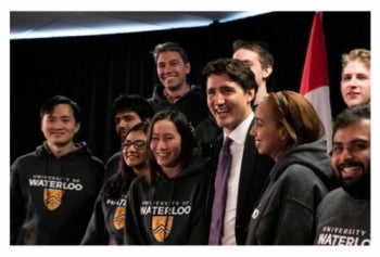
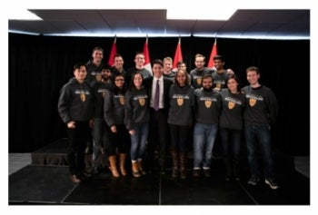
Feature authentic experiences
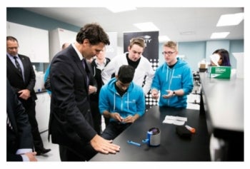
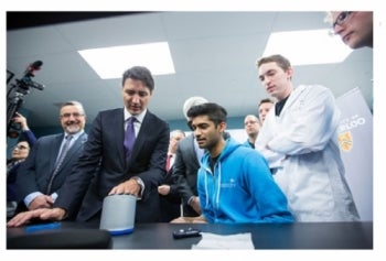
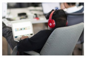
Showcase true and realistic moments where the subjects are engaged in what is happening. While candid photos are usually best, there are some instances in which having the subject look at the camera adds value (e.g., to create connection with an individual being profiled).
Ideal

Avoid

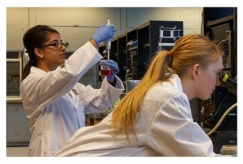
Show our work in context
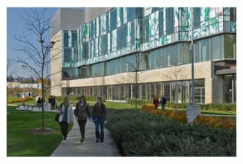
The places where we create are a part of the story and provide context. Show our work in settings where Waterloo students, staff, faculty and alumni innovate, explore and discover.
Ideal

Avoid

Be candid
Capture moments from a human perspective. The photographer should feel like a participant, not an observer.
Ideal
Avoid
Use natural light
Take advantage of natural light to ensure the photo feels authentic. Shooting at different times of day can add visual interest. You can use studio lighting to mimic natural light if necessary.
Ideal

Avoid

Use the background for context
Pull back in-focus shots to bring clarity and context to the entire scene. When possible, ensure the photo is recognizably Waterloo. In rare cases, you can use select focus, for example, when the background isn't relevant to the story and the design will have text overlaid on the image.
Ideal

Avoid
Humanize buildings
Shoot buildings in a way that highlights their architectural features and angles. Where possible and appropriate, feature people in the scene.
Ideal
Avoid

Be genuine
Shoot moments before a grab-and-grin pose to capture genuine smiles and interactions.
Ideal
Avoid
Incorporate branding
Feature University and affiliated logos in the background or on apparel to make locations feel distinct to Waterloo.
Ideal

Avoid
Generative renders
Inventiveness is a quality that sets Waterloo apart. Generative renders are a visual style we use to express our experimental nature and communicate ideas, accomplishments and discoveries from Waterloo. They are always connected to the content and meaning of the work they represent, and are specifically used to show research, discovery and transformation.
Ideal
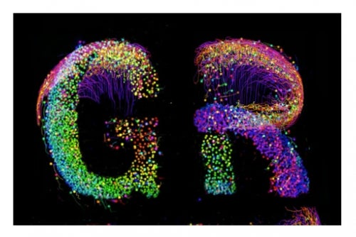
An algorithm developed at Waterloo can form the basis for unexpected visuals, such as type that mimics cell growth.
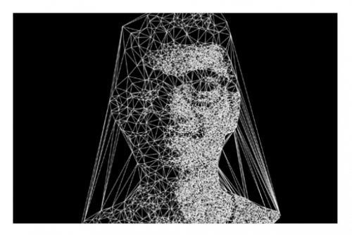
Portraiture can be rendered using code, in this case using Voronoi tessellation.
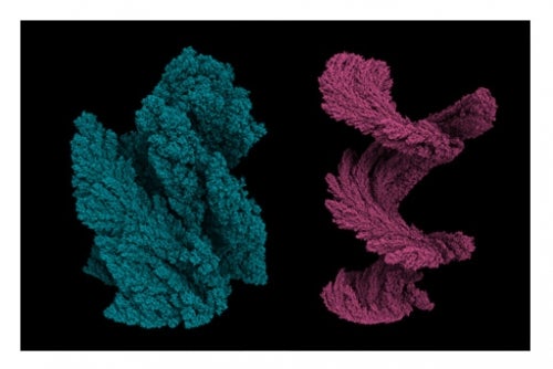
Organic forms created using code and the process of accretion can be used to create a similar yet diverse look and feel across multiple applications.
Avoid

Avoid renders that are expected and literal. Whenever possible, they should be based on specific work at Waterloo.

Avoid renders that are generic.

Avoid renders that are dated and cliché.
Illustration
Certain ideas are more compelling when told through illustrations rather than photographs. Use the following guidelines when designing illustrations for Waterloo marketing and communication materials.
- Highlight ideas — Communicate main ideas or high-level concepts, not technical details. You shouldn’t need any specialized knowledge to understand the illustration.
- Visualize data — Illustrate specific findings that cannot be captured in photos or video.
- Share a new perspective — Illustrations should be thought-provoking, expressive and unexpected, allowing viewers to think about ideas or topics in new ways.
- Catch the viewer’s eye — Creating an image that is visually captivating and unique attracts attention to a story. Illustrations should never be too literal or generic.
- Add value and meaning — Illustrations should enhance the story, adding a new layer of meaning or summarizing an idea in a way words cannot. They should never be used purely as embellishment.
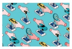
This illustration showing the connectivity and convenience of a taxi app is visually captivating and conveys the high-level idea.

This illustration depicting data theft via social networks conveys a story in an unexpected and accessible way.

This illustration about types of contagion in a financial crisis is thought-provoking and expressive.

Some illustrations don't readily convey meaning or are used purely as embellishment. Use illustrations to communicate specific ideas.

Some illustrations that may be appropriate for use in textbooks or lectures, are not as accessible for marketing and communications purposes.

Avoid illustrations that are too technical or require deep technical knowledge when communicating stories in our external communications.
Infographics
As a research-intensive university, our stories are brimming with interesting facts, figures and ideas. We use infographics to creatively and succinctly showcase data and data relationships that tell stories about our work and people.
Hierarchy through typography
Hierarchy guides the reader’s eye, shows relationships between ideas and creates clarity.
Set data in Bureau Grotesque at the largest point size, with sub-copy set in Le Monde Livre Std and captions set in Typ1451. If the main fonts aren’t available, use the approved alternatives.
Use bold keylines to separate blocks of data.
Colour
Colours adds visual appeal to an infographic. Use it purposefully as a way to represent amounts or groupings of data.
Symbols
Symbols or icons are a tool to display data in an intuitive way. Use symbols only where appropriate and if they help enhance the message and communicate data more effectively. Avoid using symbols decoratively or without purpose.
Sample applications

This infographic shows data set in Bureau Grotesque with the sub-copy set in Le Monde Livre, the caption set in Typ1451, and a bold keyline at the bottom.
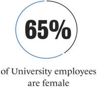
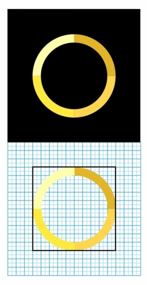
This infographic shows data set in Bureau Grotesque inside a circle icon that visualizes the percentage. Sub-copy is set in Le Monde Livre.
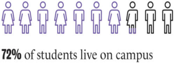
This infographic uses meaningful icons to depict the percentage communicated by the data.
Symbols
In order to stay consistent, our brand extends into every image we use, all the way down to the smallest symbol. We use a distinct style of symbol inspired by the forms, rounded corners and line weight of our brand typography, Typ1451. This helps establish unity between the type and icons we use.
Follow these tips for using symbols in marketing and communications materials:
- Ensure that symbols are simple, clear and consistent.
- Use a 32-square grid as the canvas.
- Make sure the stroke or outline of the icon is one square thick.
- Round stroke caps and corners.
- Fill symbols only when high visibility is required (e.g., parking arrows).
Resources
Download brand resources using the links below:
Sample applications
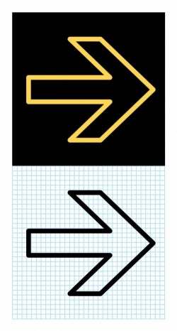
Arrow symbol
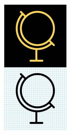
Globe symbol
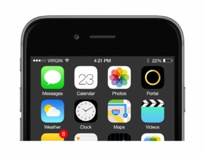
App icons
Icons enhance the functionality of apps while communicating a consistent brand. Waterloo app icons use one of the brand’s most recognizable elements – the colour bar – to create a cohesive look and feel.
Follow these tips for developing app icons:
- Ensure that icons are simple, relevant to the app and consistent.
- Use a 32-pixel square grid as the canvas.
- Maintain a border of at least six pixels from the icon to the edge of the canvas.
- Make sure the stroke or outline of the icon is two pixels wide and evenly divided between the four colour blocks of the University or faculty colour bar. (Note: Cross-faculty apps should use the University colour bar).
- Ensure icons are scaled evenly and appear as a set.
- Always place icons on a black background.
Sample applications
Portal app icon
WatSafe app icon
Faculty app icon
Sample icon in-context


